Autumn does not arrive in a box of decorations. It arrives at four in the afternoon, when the light turns gold and then goes out.
Most fall decor advice starts with objects: buy these gourds, hang this garland, fill that basket. It skips the part that actually changes. In September the sun drops lower and crosses the room at a different angle, the daylight hours shorten by roughly two minutes a day, and the way a home gets used shifts with them — people move inward, sit longer, eat later, and turn on lamps at teatime. Consequently the rooms that feel right in autumn are not the ones with the most seasonal props. They are the ones that have adjusted to the light.
What follows is a guide built on that premise. It covers palette, material and texture, then works room by room, and it treats the season as a set of decisions about warmth and surface rather than a costume to put on the house in October.
What actually changes in autumn
Three things shift, and every good autumn room answers all three:
- The light gets warmer and lower. Summer sun arrives high and white; autumn sun comes in sideways and yellow, then leaves early. As a result, colours that looked crisp in July can read as cold by October — a cool grey wall that felt calm in summer often feels flat once the light warms. Notably, this is why so many people reach for orange in autumn. The instinct is right even when the execution is not; what the room wants is warmth in the palette, not pumpkins on the sideboard.
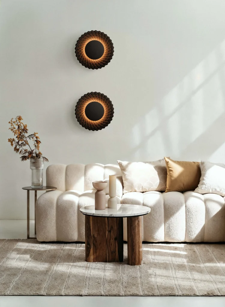
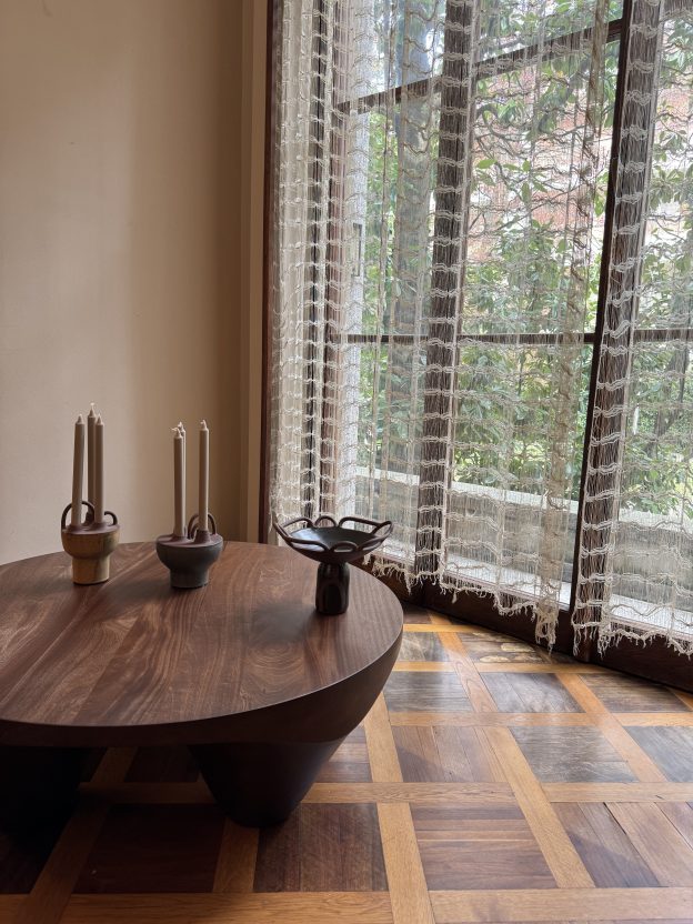
Artificial light takes over. From late September, most rooms are lit by lamps and candles for the majority of their waking use. Therefore the objects that matter most are the ones that interact with a low, warm, point source: matte surfaces that absorb it, glazed ones that catch it, metal that throws it back. A candleholder does more seasonal work than any amount of faux foliage, because it changes the light rather than decorating the room.
- The house gets used differently. Meals move indoors and run longer. Reading happens in the evening rather than the garden. Furthermore, people touch more things — throws, cushions, mugs, the arms of chairs — so tactility stops being decorative and becomes functional. Autumn is the season when texture earns its keep.
Building a fall palette
Autumn palettes fail in one of two ways: too literal, or too timid. The literal version reproduces a bag of leaves — orange, brown, more orange. The timid version changes nothing and wonders why the room feels cold in November. What works sits between them, and it is built from three or four tones rather than a whole spectrum.
Warm neutrals as the base
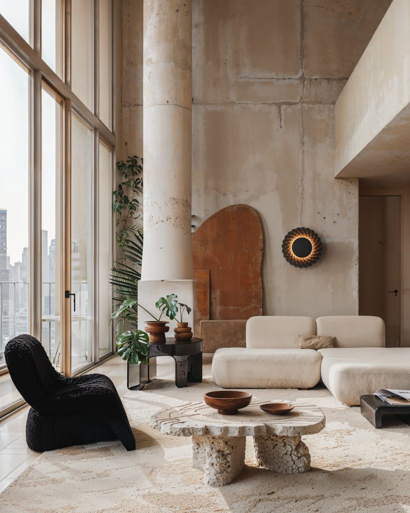
Neutral fall decor is the most useful starting point and the least discussed. Oatmeal, bone, sand, undyed wool, raw plaster: these read as warm without announcing a season, and they let one or two saturated pieces carry the whole scheme. Specifically, swapping cool-white textiles for cream and unbleached linen shifts a room’s temperature more than any accent object will.
Terracotta, rust and ochre
This is the register most people mean by autumn, and it works best in material rather than paint — fired clay, oxidised metal, natural pigment. Terracotta earns its place because it is a colour that comes from a process: iron in the clay, changed by heat. Consequently it never looks applied, which is exactly the failing of orange plastic.
Deep and dusty tones
Oxblood, aubergine, forest, teal and charcoal give autumn its depth and stop a warm scheme turning saccharine. Moreover, dusty and desaturated versions of these — clay pink, sage, muted blue — carry the season without the heaviness that full-strength jewel tones bring. Pink fall decor sounds improbable until you see it as the dusty end of terracotta, at which point it becomes one of the more sophisticated autumn palettes available.
Blue, black and the case for contrast
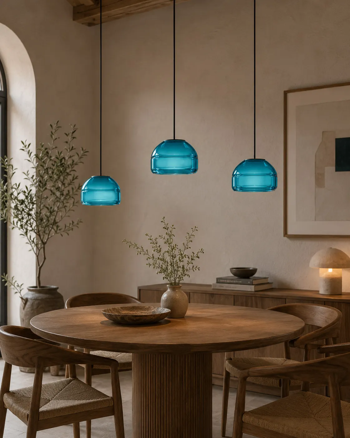
Blue fall decor works precisely because it is not expected: a deep indigo or slate against warm neutrals reads as autumn evening rather than autumn leaf. Black does similar work, giving a warm room the structure it needs to avoid feeling like a scented candle advertisement. By contrast, a room built only from warm tones flattens out under lamplight — one cold or dark note gives the eye somewhere to rest, a principle explored further in our look at black and white in design.
Materials and texture for autumn
If palette sets the temperature, material decides whether a room feels like autumn or merely looks like it. The season rewards surfaces that absorb light and reward touch, and it punishes anything glossy, thin or obviously synthetic.
Wool and woven fibres
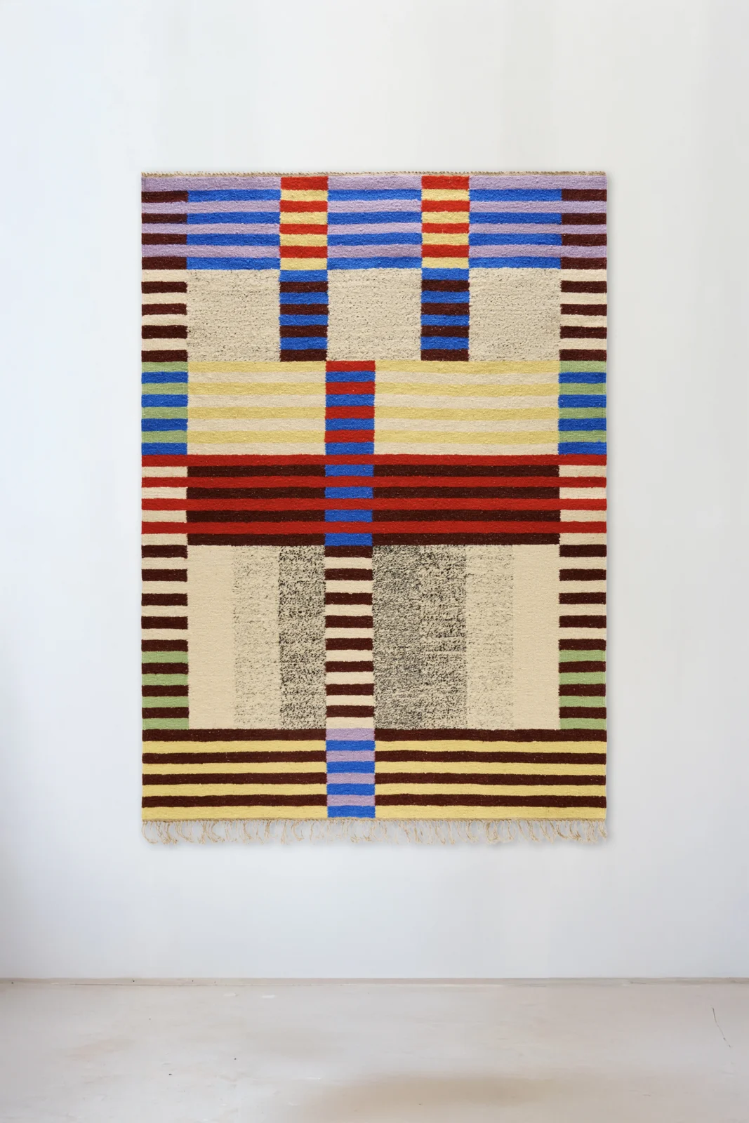
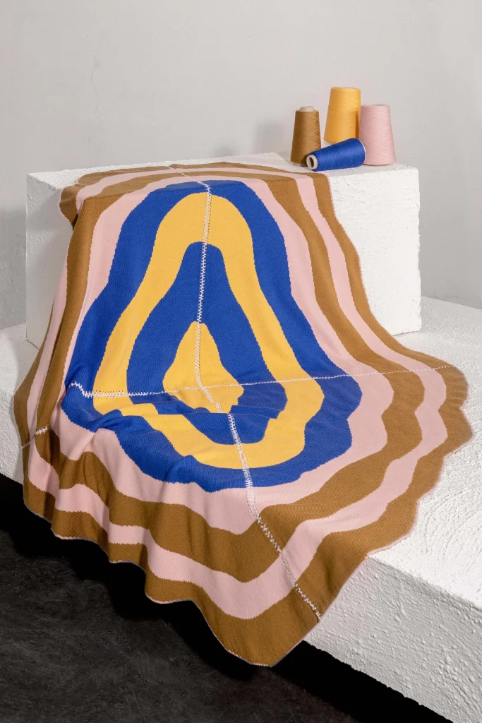
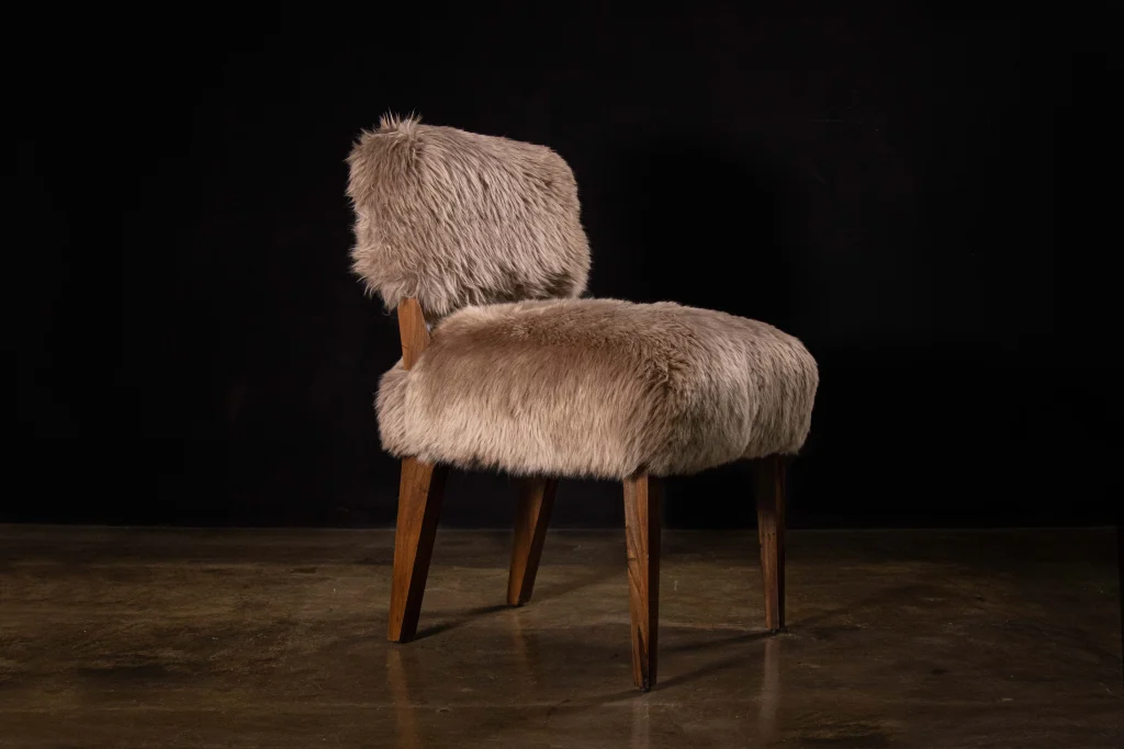
Wool is the season’s defining fibre — it insulates, it absorbs sound, and it reads as warm before you touch it. Throws, cushions, and a heavier rug underfoot do more for a room in October than any object on a shelf. Furthermore, layering two weights of textile rather than one creates the depth that makes a room feel settled; there is more on the fibre in our wool feature and on grounding a room in our guide to rugs.
Wood and reclaimed timber
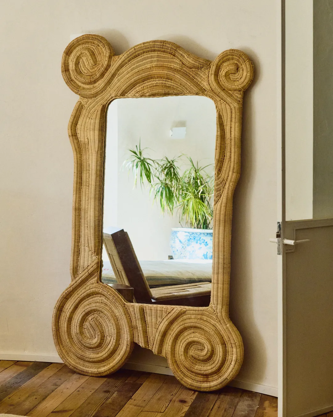
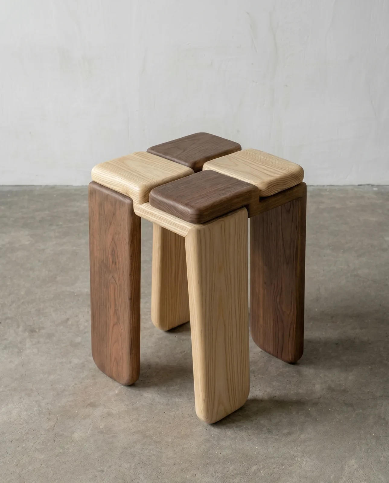
Wooden fall decor works because grain is pattern that never competes. Oak, walnut and reclaimed plywood all bring visible age, and unfinished or oiled surfaces hold lamplight far better than lacquer. Notably, one substantial wooden object usually beats a collection of small ones.
Ceramics and fired earth
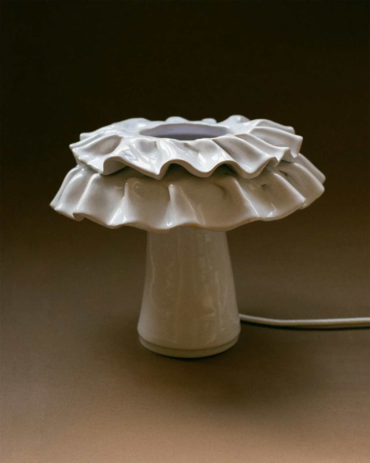
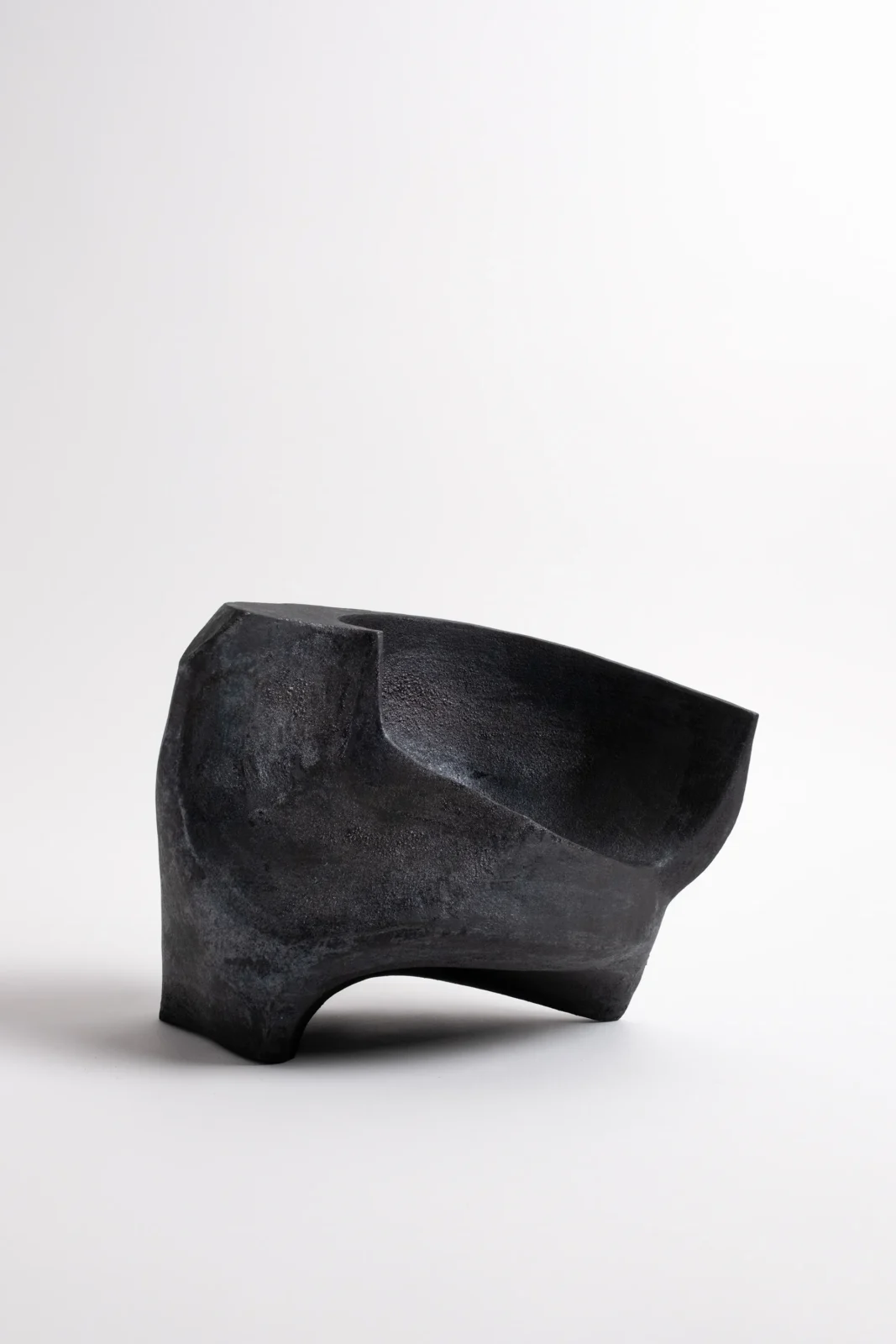
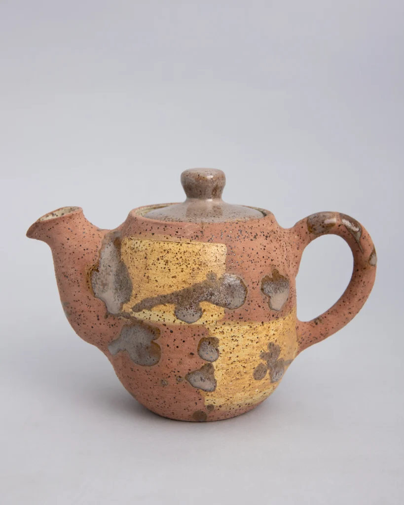
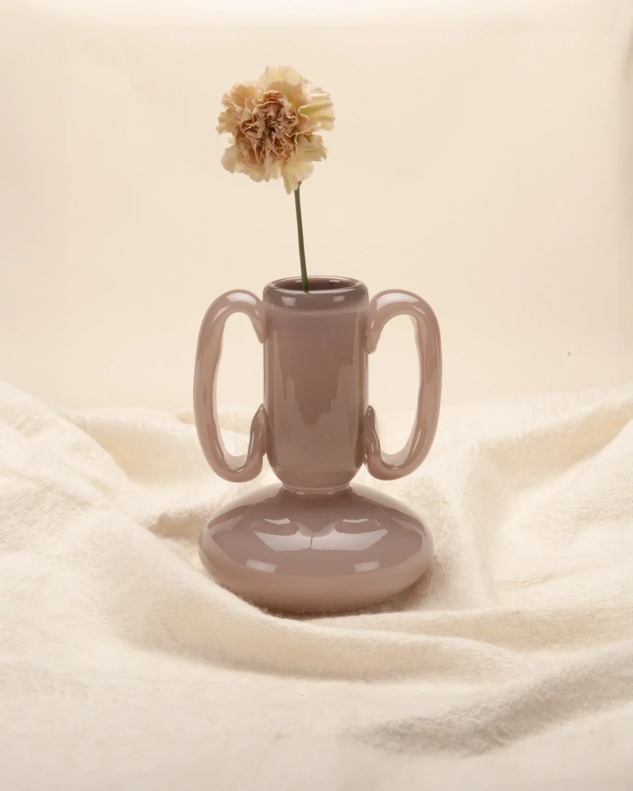
Clay is the most autumnal material there is, because heat is written into it. Stoneware, terracotta and raku all carry evidence of the kiln — scorch, speckle, crackle, uneven glaze — and matte or unglazed surfaces hold candlelight in a way that shiny ceramics cannot. Consequently a single fired vessel often does the work that a whole seasonal display is attempting.
Metal, glass and dried florals
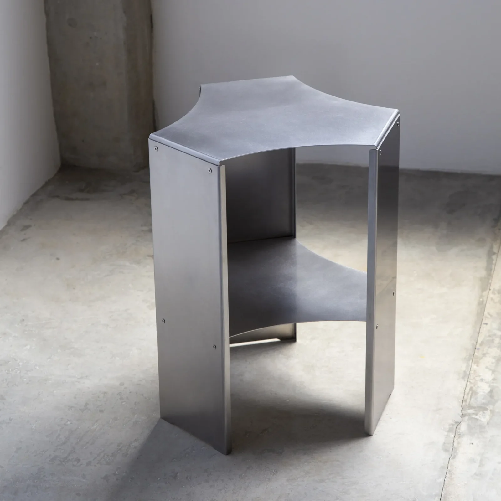
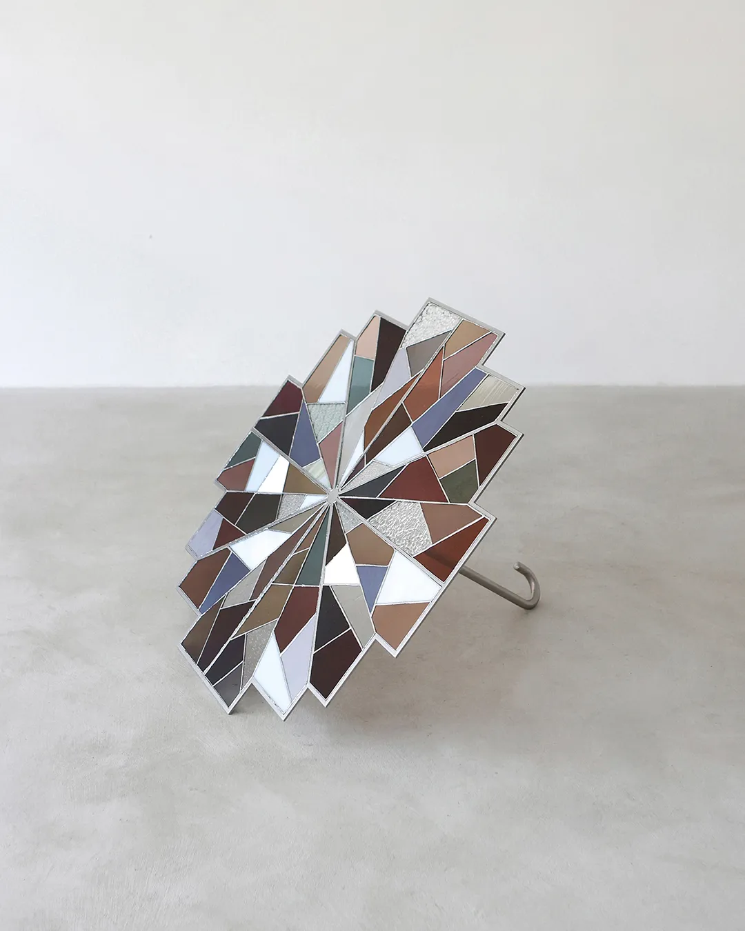
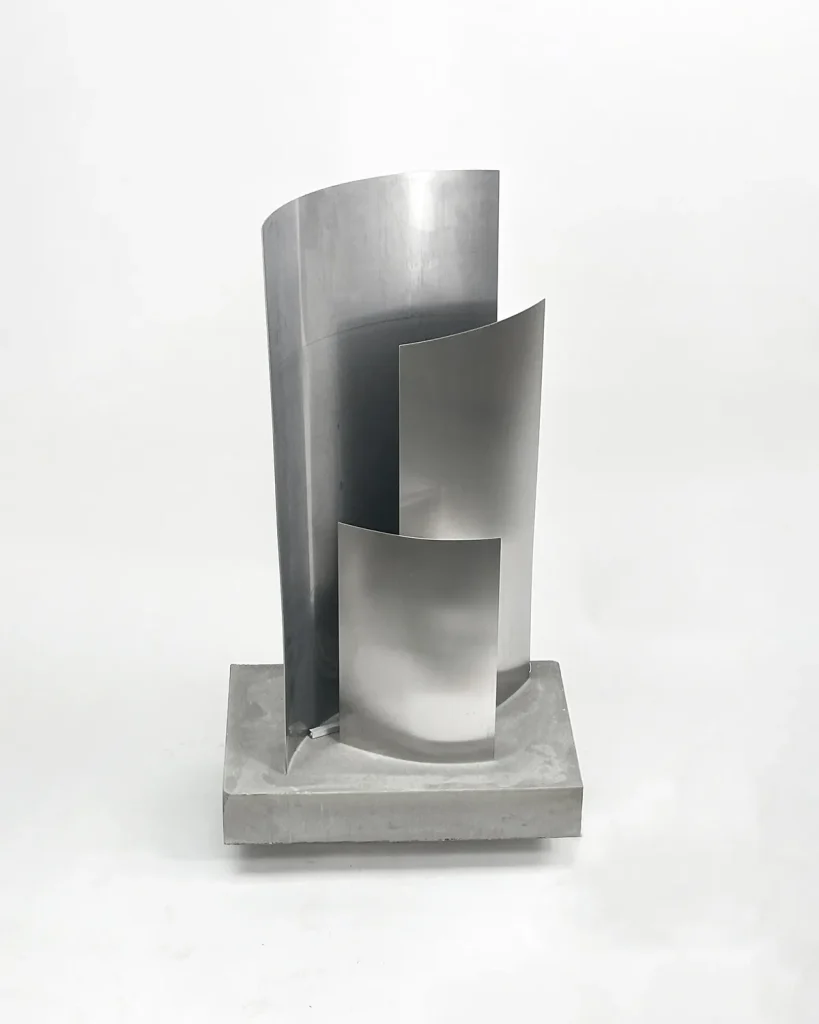
Brushed aluminium, blackened steel and wrought iron all catch a low flame and hold it, which makes metal an autumn material despite its reputation for coldness. Amber, smoke and brown glass do the same optically, warming whatever passes through them. Dried florals, meanwhile, are the one traditional autumn gesture worth keeping: seed heads, grasses, branches and hydrangea last months, cost little, and bring the season indoors without pretending to be something they are not. Fresh stems die in a week; dried ones become part of the room.
Fall decor room by room
Living room
Start with textiles and light, not objects. A heavier throw over the arm of the sofa, two cushions in a warmer weight, and lamps switched to a lower colour temperature will change a living room more than a table of seasonal props. Then edit the coffee table down to three things — a vessel, a book, a light source — and leave the rest of the surface empty. Consequently the room reads as considered rather than dressed. There is more on the underlying arrangement in our living room guide and our cosy living room ideas.
Mantel and fireplace
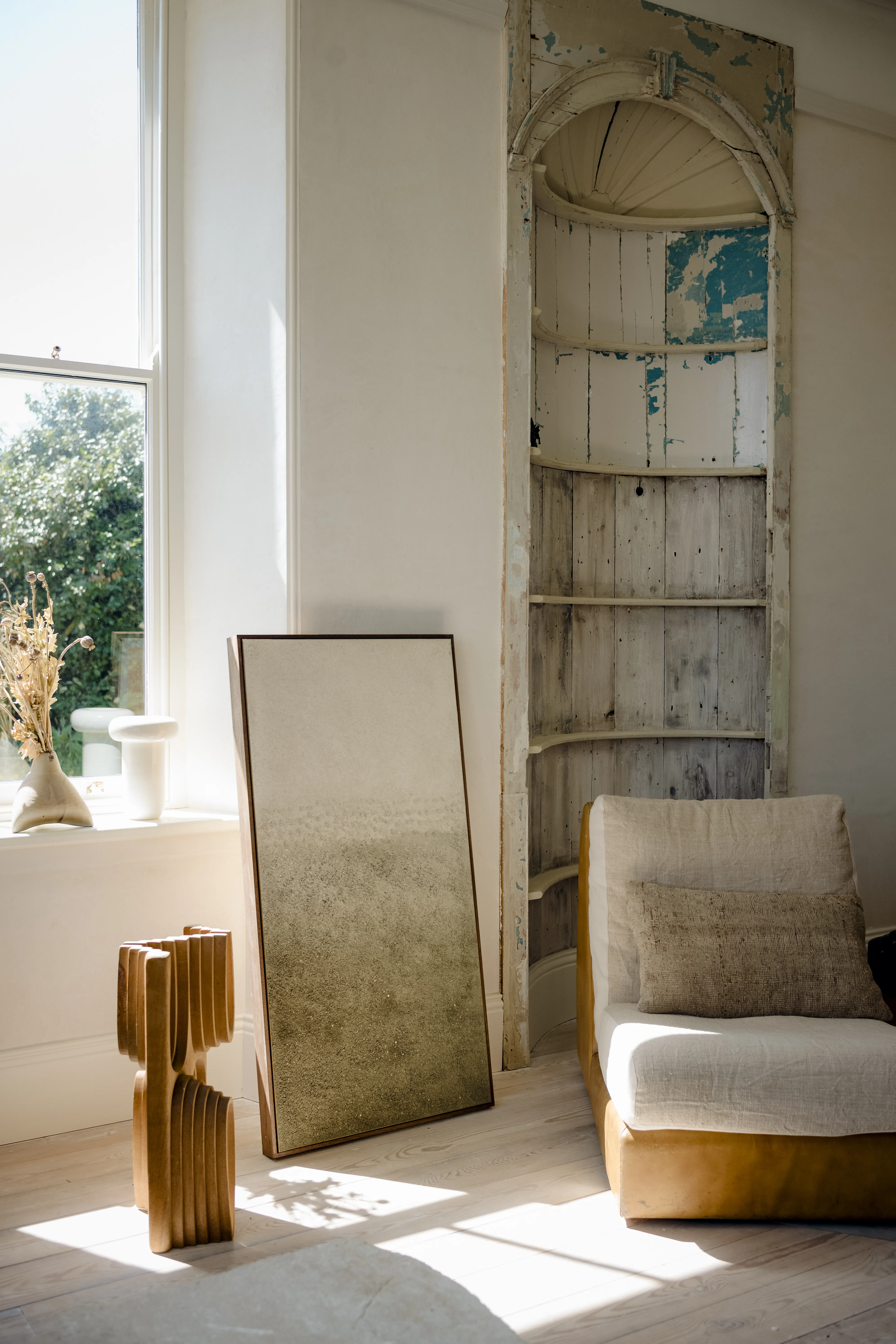
A mantel is a shelf with an audience, and the common error is symmetry plus quantity. Work instead with one tall anchor placed off-centre, a horizontal element such as a leaning mirror or artwork behind, and a small cluster at the opposite end — odd numbers, varied heights, deliberate gaps. Furthermore, keep the middle of the shelf clearer than the ends; a mantel crowded at the centre loses its architecture. Where the fireplace is unused, a single sculptural object in the opening reads better than logs arranged for effect.
Dining table
Autumn tables are for long meals, so build for the middle of the evening rather than the first photograph. A runner or bare wood, low candlelight along the centre line, and one substantial vessel instead of a full centrepiece leaves room for actual food. Specifically, keep everything below eye level when seated — anything taller blocks conversation, which is the point of the table. Dried grasses laid flat down the centre cost nothing and last the whole season.
Entryway
An entry is where the season should register first and take up least room. A console with one tall vessel of branches, a mirror to move the shorter daylight around, a basket for the wet things autumn brings, and a runner that can take mud. Moreover, a lamp on a hall console rather than an overhead fitting changes the first thirty seconds of coming home more than any other single move. Our entryway strategies go further into the layout.
Kitchen
Kitchens resist decoration and reward usefulness, so autumn belongs here in things you actually reach for: a wooden board left out, a stoneware bowl of apples or squash, linen tea towels in a warmer tone, a jug of grasses on the island. By contrast, purely ornamental seasonal objects in a working kitchen simply get moved. Cozy fall kitchen decor is mostly a matter of swapping cool textiles for warm ones and leaving good materials visible.
Bedroom
Layer weight rather than adding objects: a heavier quilt, a wool throw at the foot, an extra pillow, and bedside light dimmed low. Blackout matters less in autumn than warmth does, so this is the season to change textiles rather than furniture. Our bedroom design guide covers the underlying decisions.
Shelves, trays and small surfaces
Shelves and trays are where autumn styling either works or turns into clutter, and the discipline is subtraction. A tray gives a group of objects a boundary, which is why it makes three items look intentional and seven look abandoned. Therefore choose the tray first, then fill to about two-thirds of it, leaving the rest as breathing space.
Porch, doorway and outdoor
Outdoor autumn decorating fails when it treats a doorway as a display shelf. A porch is architecture, and the things that work with it are scale, symmetry and light — not quantity.
Begin with proportion. A door reads best flanked by two objects of real size, or one placed decisively to one side; a scatter of small pots looks like leftovers. Consequently a pair of large planters with structural evergreens, ornamental grasses or a single branching shrub outperforms almost any seasonal arrangement, and it survives into winter. Then add light: lanterns at the threshold, low-level lighting along a path, or a single warm bulb by the door matter enormously once dusk arrives at five. Finally, keep the palette to two or three tones. Where pumpkins appear, group them by colour and size in odd numbers on the steps rather than lining them symmetrically, and choose the pale, ribbed and green varieties over uniform orange — they read as produce rather than decoration. Simple fall porch decor is genuinely the strongest version: one good planter, one lantern, a doormat that has been swept.
Fall decor ideas by aesthetic
Modern and pared-back
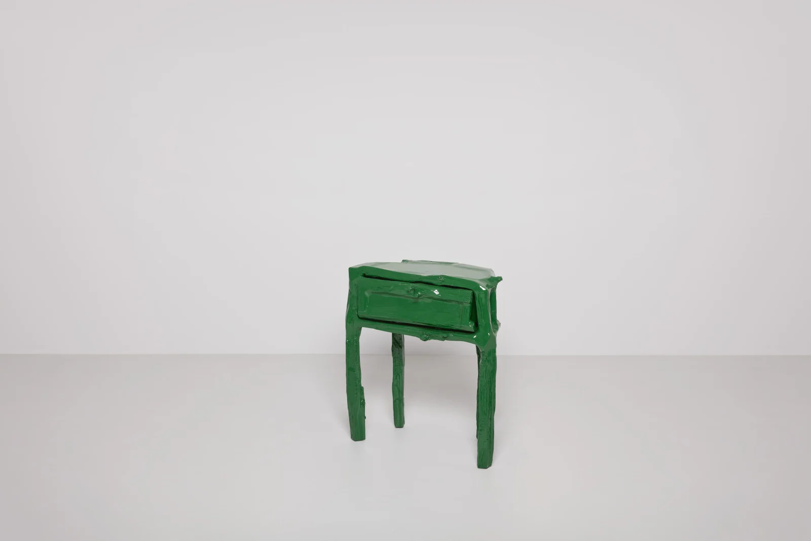
Modern fall decor works by reduction: one strong material gesture, a tight palette, and nothing that could be described as a motif. A single sculptural vessel with three dried branches, warm lighting, and a change of textile is the whole scheme. Minimalist fall decor takes the same route and simply removes one more object.
Rustic, vintage and farmhouse
These registers depend on genuine age and genuine wear — reclaimed wood, hand-thrown stoneware, worn metal, old linen. Rustic fall decor collapses the moment the objects are new things made to look old, so it is worth buying fewer and better. Meanwhile, vintage pieces bring the patina that the whole aesthetic is reaching for, and one real object carries more weight than a shelf of reproductions.
Boho, coastal and Scandinavian
Boho leans on layered textiles, natural fibre and dried botanicals, holding a busier palette comfortably — a balance our boho feature unpacks. Coastal autumn shifts from bleached blues to grey-greens, driftwood and warmer sand tones. The Scandinavian approach is the most disciplined of the three: pale wood, undyed wool, candlelight, and almost no seasonal objects at all, which is why it reads as autumn all the way to February.
What is shifting in fall decor 2026
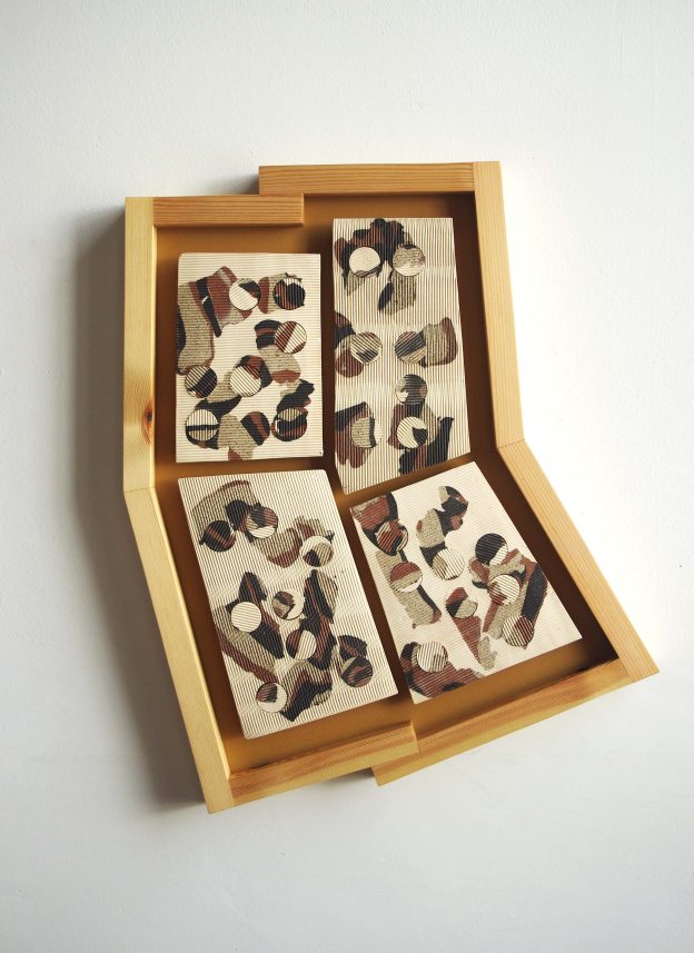
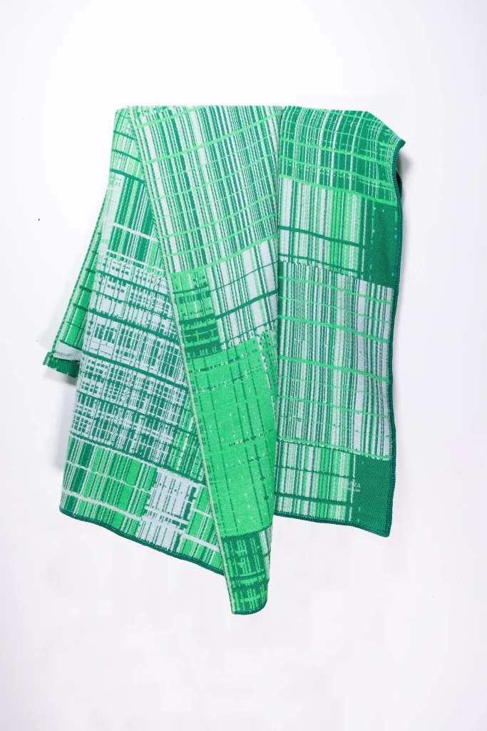
Two directions are visible this year. Orange is receding in favour of dusty clay, oxblood and brown, and brown in particular has moved from unfashionable to central. In addition, seasonal decorating is consolidating around fewer, larger, better objects — a shift away from tablescaping toward pieces that stay out all year and simply get read differently in October.
How to layer it without clutter
- Work in odd numbers. Groups of three and five resolve; groups of two and four compete.
- Vary height deliberately. Three objects of the same height read as a row. Aim for a clear tallest, middle and lowest.
- Give each group a boundary. A tray, a book, or a defined edge turns a pile into a composition.
- Leave a third of every surface empty. Negative space is what makes the filled part look chosen.
- One focal point per sightline. If two objects compete for attention from the doorway, move one.
- Repeat a material, not a motif. Terracotta appearing three times across a room ties it together. Three pumpkins do not.
- Change the light before you change the objects. Lower, warmer and more numerous sources do the heaviest seasonal lifting.
What to skip
Some of the most common autumn gestures actively work against a room. Faux leaf garlands read as plastic under warm light, precisely when the light is warmest. Scented candles in competing fragrances cancel each other and give a house a lobby-like anonymity — one scent, or none. Anything printed with the word “harvest” is decoration about decoration. Uniform orange plastic pumpkins have no material argument behind them at all, whereas real gourds have colour that came from growing.
Similarly, resist decorating every room. A house where each surface has been seasonally styled feels like a showroom in September. Two or three rooms carrying the season properly, with the rest left alone, reads as a home that changed rather than a home that was decorated.
Storing it, and moving into winter
Autumn pieces should transition rather than disappear. The palette of oxblood, brown and warm neutral carries into December without adjustment, so the honest work at the end of November is subtraction plus a shift toward evergreen and metal. Consequently the objects worth owning are the ones that never looked seasonal in the first place.
For what does get put away: keep dried florals in a dry, dark place, since light bleaches them and damp collapses them. Wrap ceramics individually and store upright rather than stacked, as unglazed stoneware chips against itself. Wool wants clean storage with air and no plastic, because moths find the unwashed and the airtight. Meanwhile, wipe candle wax from metal and stone while it is still slightly warm rather than picking at it cold, and keep cast stone and terracotta off unheated concrete floors over winter, where they draw up damp.
Frequently asked questions
When should I start decorating for fall?
Early September is the natural point, because that is when the light and the daily routine actually change rather than when the shops begin selling. Textiles and lighting can shift as soon as evenings draw in. Anything explicitly harvest or Halloween-related is better held to late September and October, so the season does not peak before it arrives.
What colours work best for fall decor?
Warm neutrals work beautifully as a base for fall decor — think oatmeal, cream and sand — layered with two or three richer shades such as terracotta, rust, ochre, oxblood, brown or forest green. Adding one darker or cooler note, such as charcoal, indigo or slate, gives the scheme structure and depth. For further inspiration, explore VERANDA’s fall 2026 paint colour trends, which explores some of the season’s key interior colour directions.
Restricting your palette to three or four tones is what separates a considered autumn scheme from a literal one. The result feels warm and seasonal while remaining sophisticated enough to work beyond fall.
How do I do fall decor without pumpkins?
Work through material and light instead of symbols. Heavier textiles, warmer lamps, candlelight, dried grasses and branches, fired ceramics and visible wood all read unmistakably as autumn without a single gourd. Indeed, most of the rooms that look best in the season contain no seasonal objects at all — only warmer surfaces and lower light.
What is the difference between modern and farmhouse fall decor?
Modern fall decor reduces: one material gesture, a tight palette, no motifs, and considerable empty space. Farmhouse and rustic versions accumulate, and depend on genuine age — worn wood, old linen, hand-thrown pottery, real patina. The failure modes differ too. Modern schemes go cold and sparse; farmhouse schemes go cluttered and, when the objects are new things made to look old, slightly false.
How do I make fall decor look considered rather than cluttered?
Reduce the number of objects and increase their size. Group in threes on a defined boundary such as a tray, vary the heights clearly, and leave roughly a third of each surface empty. Repeating one material across a room ties it together far more effectively than repeating a motif, and limiting yourself to two or three rooms keeps the whole house from reading as a display.
What do I do with fall decor after Thanksgiving?
Most of it should stay. The autumn palette carries straight into winter, so the work is removing the explicitly seasonal items and shifting toward evergreen, metal and more candlelight. Store dried florals dry and dark, ceramics wrapped and upright, and wool with air rather than in plastic. Pieces chosen for material rather than season need no storage at all.
Why autumn rewards fewer, better things
The season asks less of a home than the industry around it suggests. Warmth, texture, lower light, and a handful of objects with real material behind them will carry a house from September to February. Consequently the most useful autumn purchase is rarely a decoration; it is a vessel, a candleholder, a throw, or a bowl that was going to be worth owning anyway and simply reads differently once the evenings close in.