Brat Green: An Electric Ode to Authenticity
Just as “Tiffany Blue,” “Hermès Orange,” and “Post-it Note Yellow” evoke instant recognition, could “Brat Green” soon join their ranks? With its namesake album dropping just a few weeks ago in June 2024, it’s perhaps too soon to predict its longevity. However, there’s no denying that Brat Green — Pantone 3570-C to be precise — has emphatically entered the pop culture zeitgeist.
This vibrant, electric green popularized by pop icon Charli XCX has become synonymous with her latest artistic phase and represents the spirit of what she and her fans are calling “Brat Summer.” Just like with many trends, the idea of “Brat” might resonate with some and leave others puzzled. Brat defies a strict definition, but its essence is clear: it’s a welcome counterpoint to polished perfection. Embracing unapologetic messiness and chaos, vulnerability and confidence, Brat represents a raw, unfiltered attitude.
Why Brat Green?
In a conversation with Billboard, Charli XCX says the album cover with it’s lime green and pixilated font was inspired by 90s rave posters and describes the particular shade of green as “quite disgusting” – a deliberate choice to challenge conventional notions of beauty and desirability. It’s meant to be “really unfriendly and uncool,” sparking a provocative dialogue about why people are drawn to or repelled by it.
Charli embraces this debate, highlighting that the design, with its pixelated font and unpolished aesthetic, is intended to provoke thought: “I’m not trying to give you something pretty; I’m trying to make you think”. In an interview with Rolling Stone, the popstar proclaims that, “it’s a fine art conversation really.” This approach is rooted in a pop art philosophy: embracing what others might dismiss as “bad” to provoke thought and debate. After all, who gets to decide what is and isn’t art?
Design Inspiration from Charli XCX’s Brat Aesthetic
Bold Minimalism
Charli XCX’s approach to the Brat aesthetic extends beyond the color itself to encompass a broader philosophy. Her “no clutter” production style on this album translates easily into design, advocating for simplicity with a focus on impactful details. Think minimalist decor accented by bold, standout elements, where the color takes center stage without dominating the space.


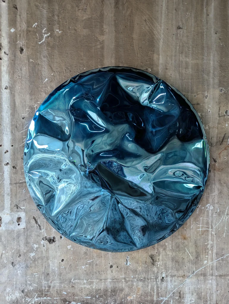
by studio b severin


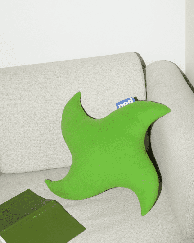

Thought Provoking
Embracing Brat in design means defying conventional aesthetic standards and eliciting provocative reactions. It’s about integrating elements that provoke thought and conversation, selecting pieces that are intentionally offbeat or unconventional to create a space that is unapologetically stimulating, both visually and intellectually.


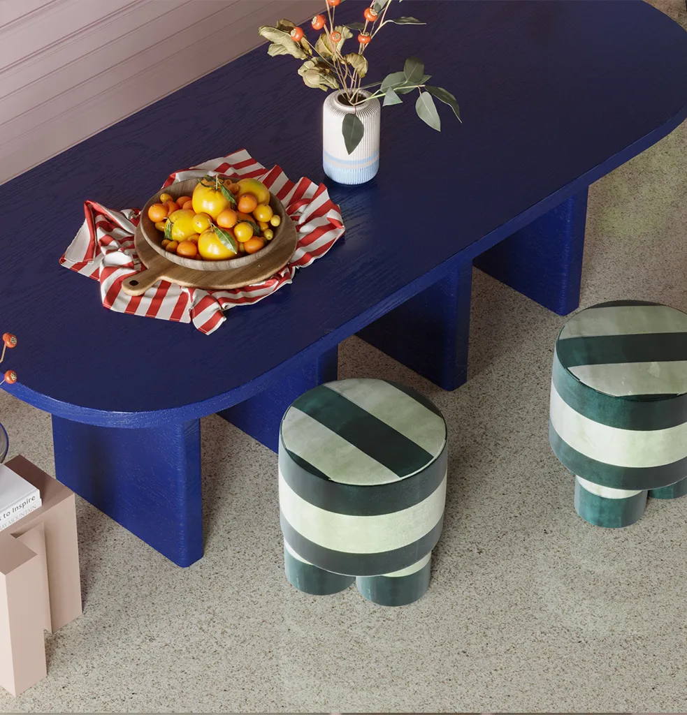
by Nicholas Devlin


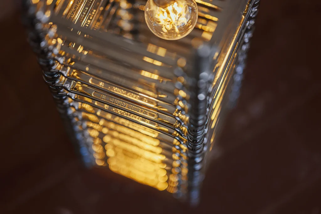
by Adir Yakobi


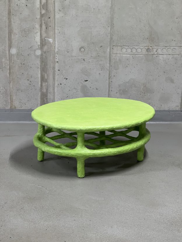

Authentic Eclecticism
Charli describes the album’s lyrics to be “like deep meaningful conversations over voice notes,” reflecting the frenetic energy and immediacy of the digital age. This can be mirrored in decor through eclectic, mix-and-match elements that tell a story and capture the fast-paced trend cycles of internet culture. It’s about creating a space that is fearlessly you, embracing all the messiness and contradictions that entails.


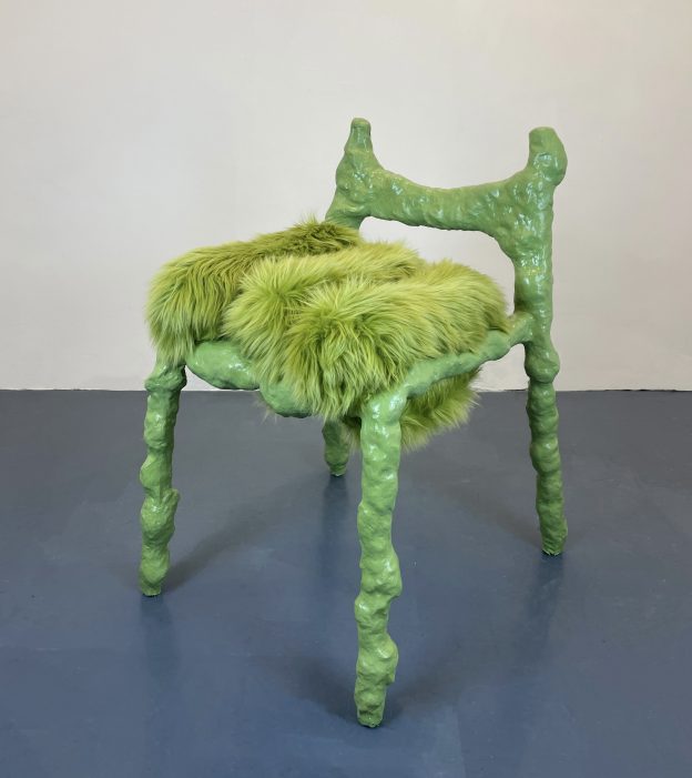

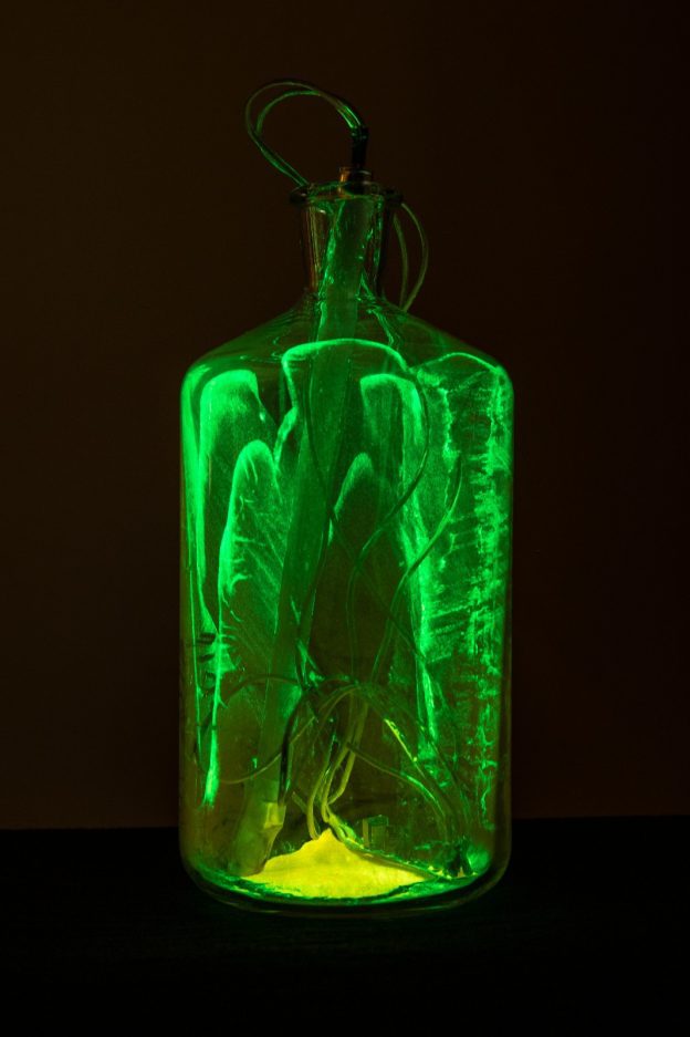


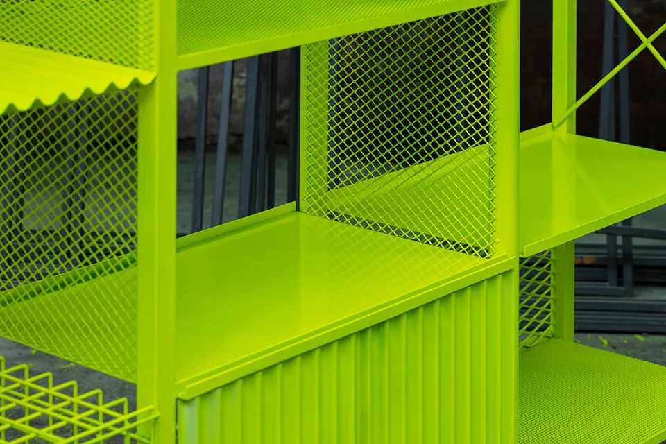
by Atelier Duyi Han
Interiors Embracing Brat Green
It may seem beyond incredible odds, but Brat green proves to be unexpectedly versatile, which, we suppose, makes it all the more Brat. All about pushing the boundaries, Brat can mean full impact maximalism or a more subdued-but-cheeky refinement. Brat offers a spectrum of possibilities for creating spaces that are surprising, expressive and personal. With bold, unconventional pieces and minimalist, impactful details, the Brat approach encourages you to explore and embrace your unique design narrative. Don’t overthink it—choose that chartreuse green at the hardware store and let the experimentation, mess, and mistakes flow. Here are some standout examples of how Brat can transform interiors in exciting and unexpected ways.
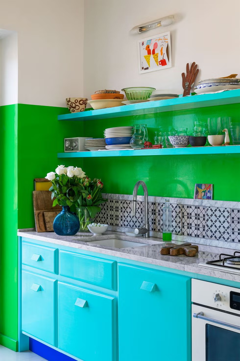


© Dean Hearne
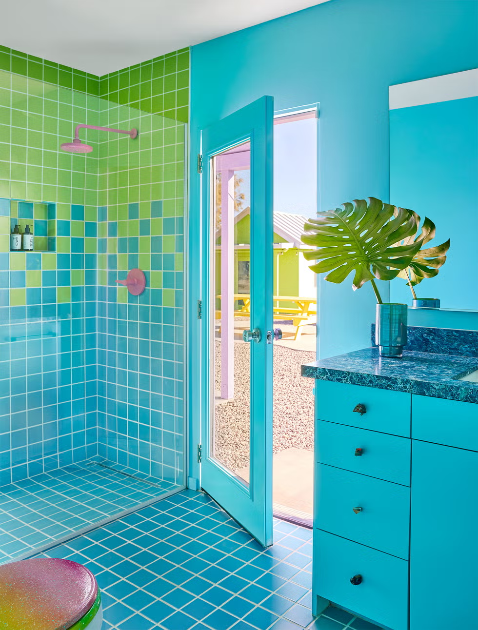


© Maree Homer


© Chris Horwood
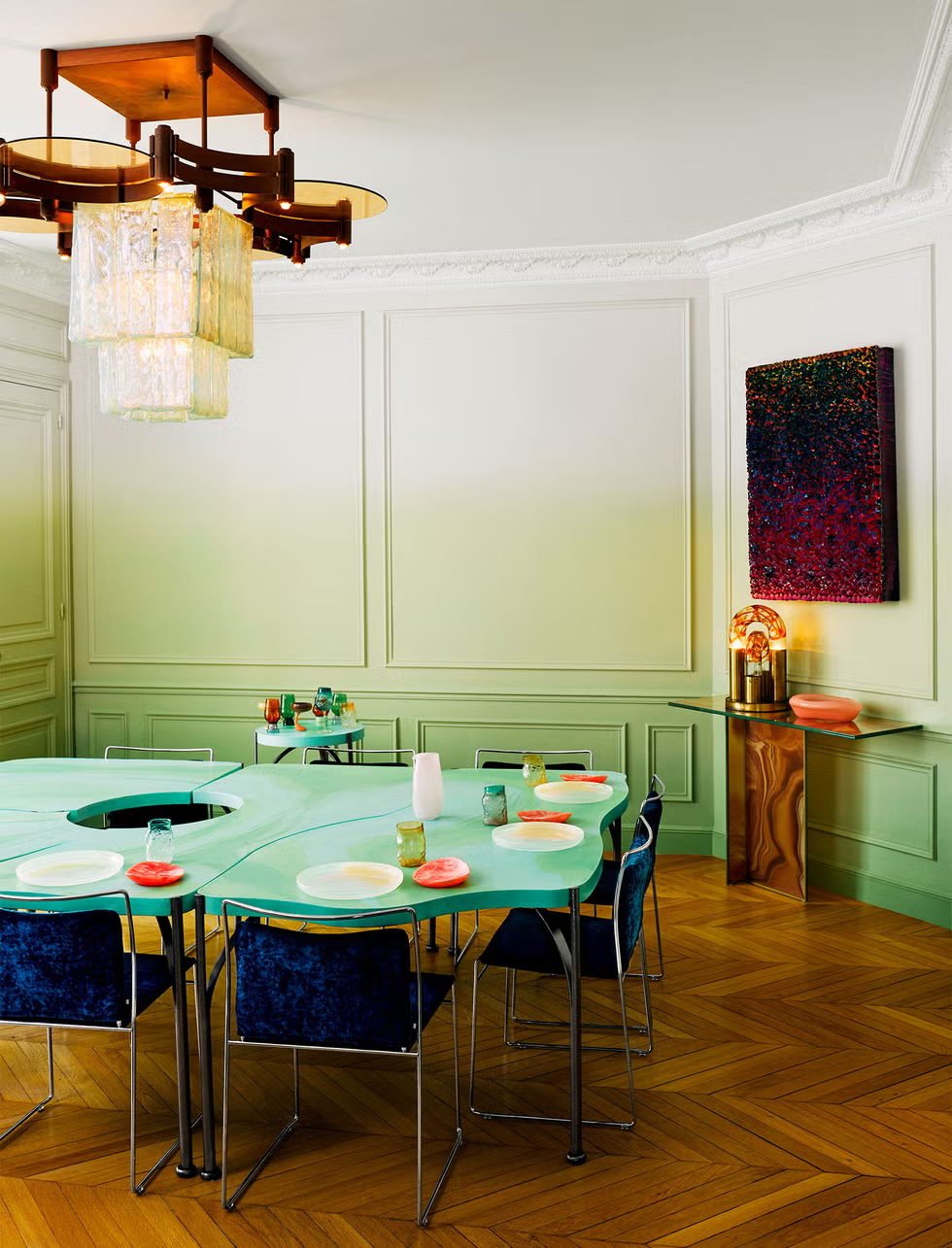
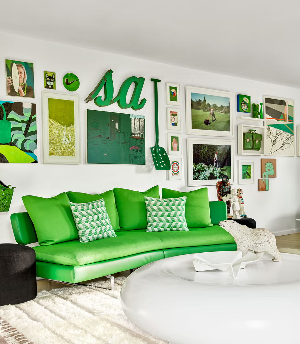
Enjoy a Brat Green Summer
As Brat Green continues to saturate the summer, it is clear this is not just a color trend, but more a bold declaration of defiance, inviting all to celebrate their individuality in all its raw, chaotic glory. Like a splash of neon paint on a blank canvas, Brat challenges us to break free from the polished facade and embrace a more authentic, unfiltered self.
In a matter of weeks, Brat Green surged from an intriguing design trend to a full-blown pop-cultural phenomenon. The color’s meteoric rise, driven by its bold embrace of individuality and self-expression, is a fitting reflection of the frenetic pace of modern internet culture and trend cycles. While it’s likely that Brat Green will be a flash in the pan, its whirlwind nature is also kind of the point. This shade serves as a compelling reminder not to take things too seriously and to embrace risks and spontaneity. It encourages decorating your space in a way that truly represents you—without overthinking it.
Brat Green’s impact may be brief, but it powerfully underscores the value of living boldly and authentically. Whether through audacious accents or a clash of eclectic elements, Brat Green channels a raw, unfiltered attitude that captures the mercurial pulse of modern life. Whether or not Charli XCX’s music resonates with you, or if this article still hasn’t fully demystified Brat, ADORNO can’t fault any ethos that promotes individuality and unapologetic self-expression, no matter how nebulous it might seem. Perhaps life is too short to not occasionally embrace your inner brat.
-

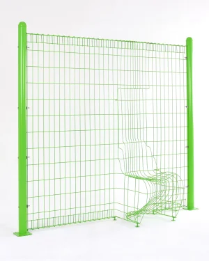 Invisible Panton ChairBy lee hyokk€3.563€3.563
 -

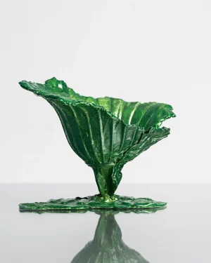 Follow The Flowers – Aluminum Decorative BowlBy Vilius Dringelis€1.450 incl. tax€1.450 incl. tax
 -

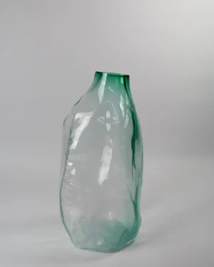 105 Ltr Forms – Emerald Green Glass ObjectBy Vogel Studio€1.838 incl. tax€1.838 incl. tax
 -

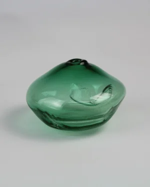 1/2 Ltr Forms – Pine Tree Green Handmade Glass ObjectBy Vogel Studio€125 incl. tax€125 incl. tax
 -

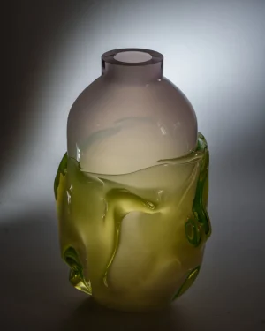 Persona Xl Uranium – Handblown Glass VaseBy MILA ZILA€1.210€1.210
 -

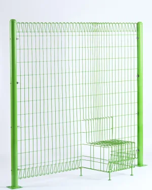 Invisible Chair No. 1 – Steel Wall ChairBy lee hyokk€2.588 incl. tax€2.588 incl. tax
 -

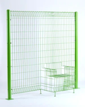 Invisible Chair No. 2 – Steel Wall ArmchairBy lee hyokk€3.088 incl. tax€3.088 incl. tax
 -

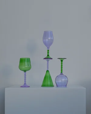 Dreamlike “teta Edition” Glass SetBy Ornamental by Lameice€244 incl. tax€244 incl. tax
 -

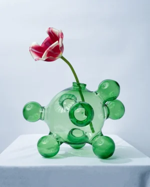 Chemistry – Glass Blown VaseBy Ornamental by LameicePrice range: €650 through €750 incl. taxPrice range: €650 through €750 incl. tax
 -

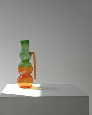 Dreamlike Glassblown PitcherBy Ornamental by Lameice€263 incl. tax€263 incl. tax
 -

 Matcha – Shades of Green Wall MirrorBy Estelle Makes Stuff€750€750
 -

 Not As Planned – Vase 1By Benjamin Foucaud€280€280
 -

 Not As Planned – Tray 2By Benjamin Foucaud€280€280
 -

 Cosmic – Steel ChairBy Mati Sipiora€570 incl. tax€570 incl. tax
 -

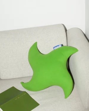 Germ PillowBy Nod Objects€113 incl. tax€113 incl. tax
 -

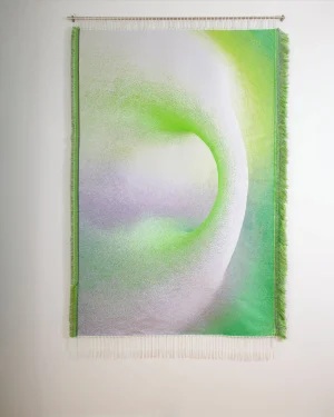 Light Mode 280 — Modern Foliage | Jacquard Woven TapestryBy Lucas Gutierrez Studio€6.143 incl. tax€6.143 incl. tax


