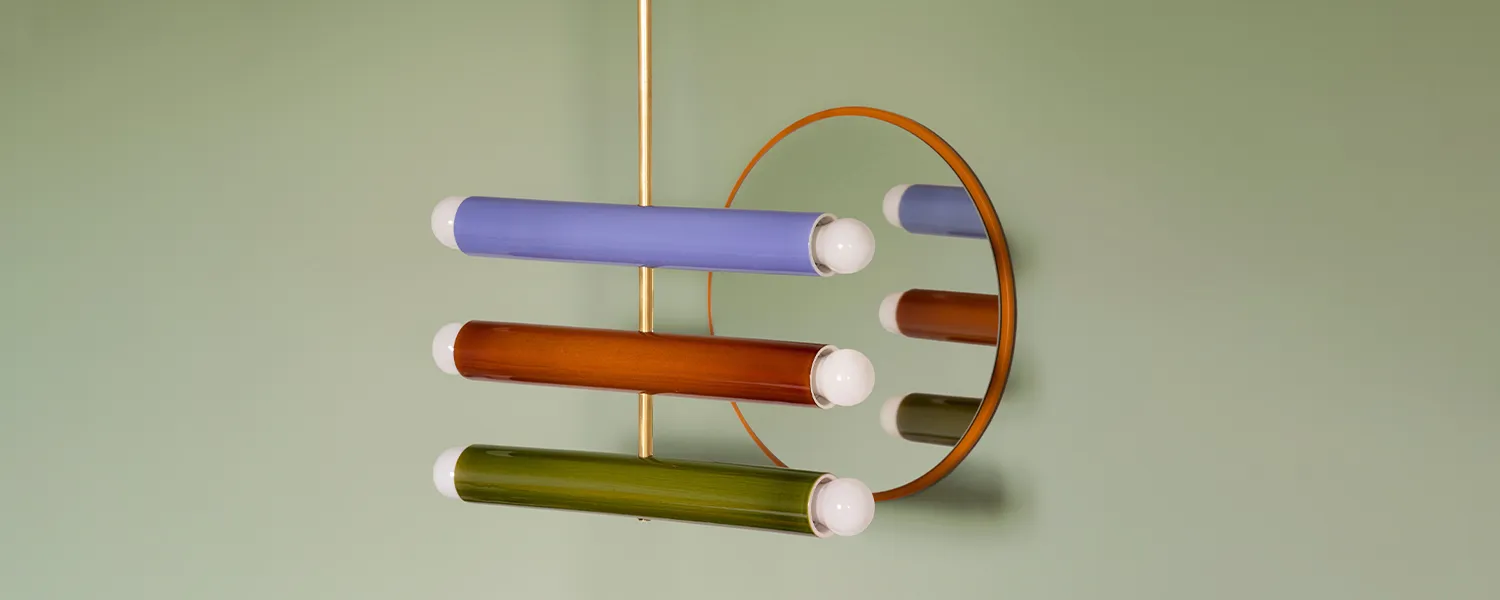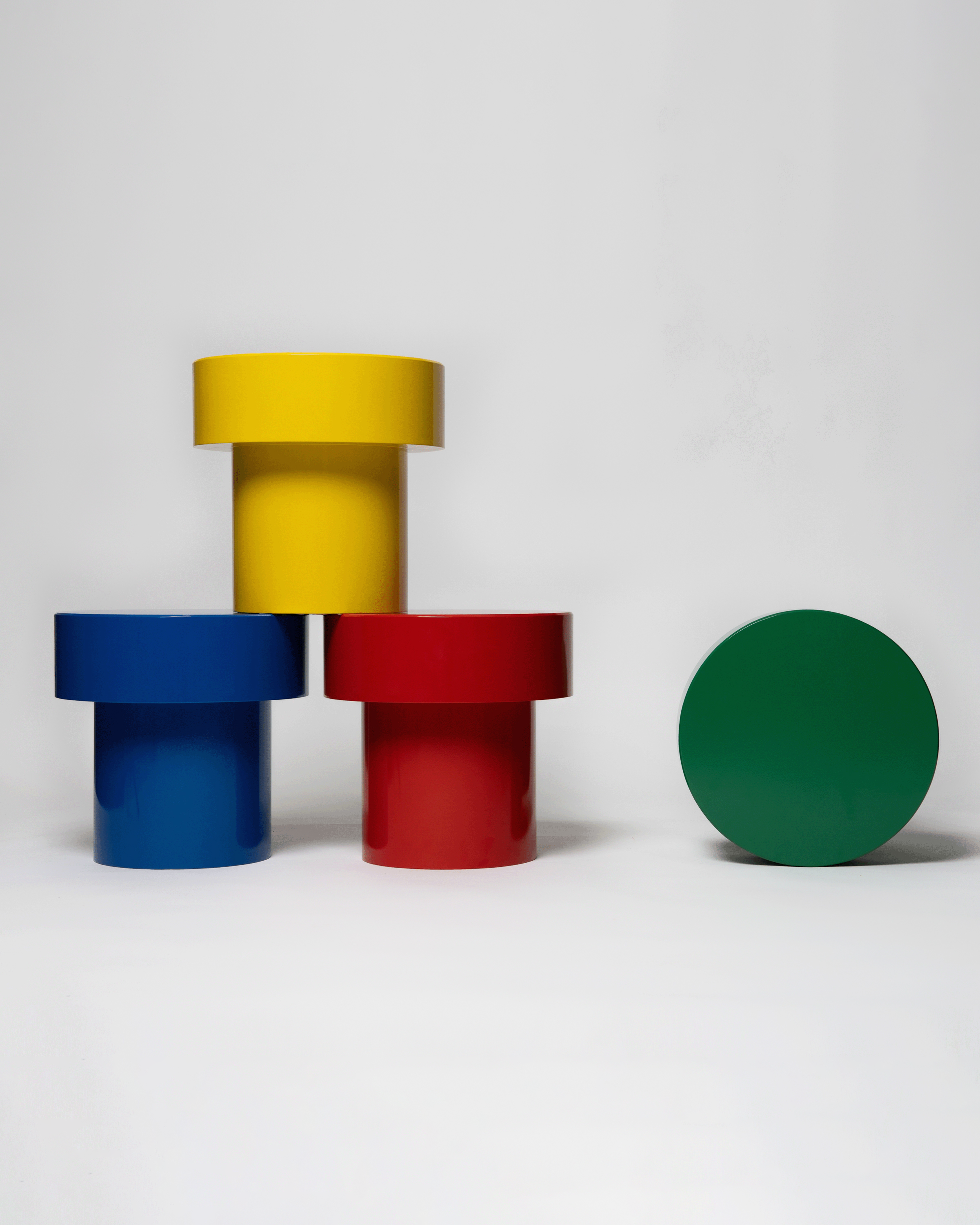
The Power of Primary Colors in Design
Color is a fundamental element of human perception, shaping emotions, aesthetics, and communication. At the heart of all visual compositions lies the primary color palette—red, blue, and yellow. These three hues serve as the foundation for every other color, forming the basis of countless artistic and design expressions. But beyond their scientific role in color mixing, primary colors possess a unique cultural and psychological significance that has endured through centuries.
Primary colors have played a vital role in art movements throughout history. The Dutch painter Piet Mondrian famously used primary colors in his geometric compositions, emphasizing balance and simplicity. Mondrian’s iconic works, such as Composition with Red, Blue, and Yellow (1930), are quintessential examples of how primary colors can express a deep sense of order and harmony. His abstraction was a direct response to the chaos of the world around him, seeking purity and clarity through simple, unadorned forms.
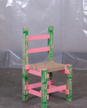
In the world of product design, primary colors continue to play a crucial role in defining iconic objects. The Mondrian Chair by Gerrit Rietveld, inspired by the bold geometry of Mondrian’s paintings, showcases the direct application of primary colors in furniture design.
Despite the infinite possibilities of color combinations available today, the primary color palette remains a fundamental and timeless element of design. Its simplicity allows for bold expressions, while its versatility enables endless creativity. From early childhood education to high fashion, from corporate logos to digital interfaces, red, blue, and yellow continue to shape the way we see and experience the world.
Baccello – Solid Wood Modular Drawer Units by Costantini Design

The Solid Wood Modular Drawer Units by Costantini Design, finished in a bold blue hue, are expertly crafted to maintain identical shapes, allowing the natural variations in the wood grain to shine through in a striking contrast. The rich, vibrant blue adds a modern touch to the warm, organic beauty of the wood, making each unit a standout piece. Whether combined to create a functional storage solution in the form of a pedestal, stairs, dresser, or nightstand, these versatile units offer both practicality and a visually captivating presence, transforming any space with their unique blend of color and craftsmanship.
Zampa by Jonathan Bocca
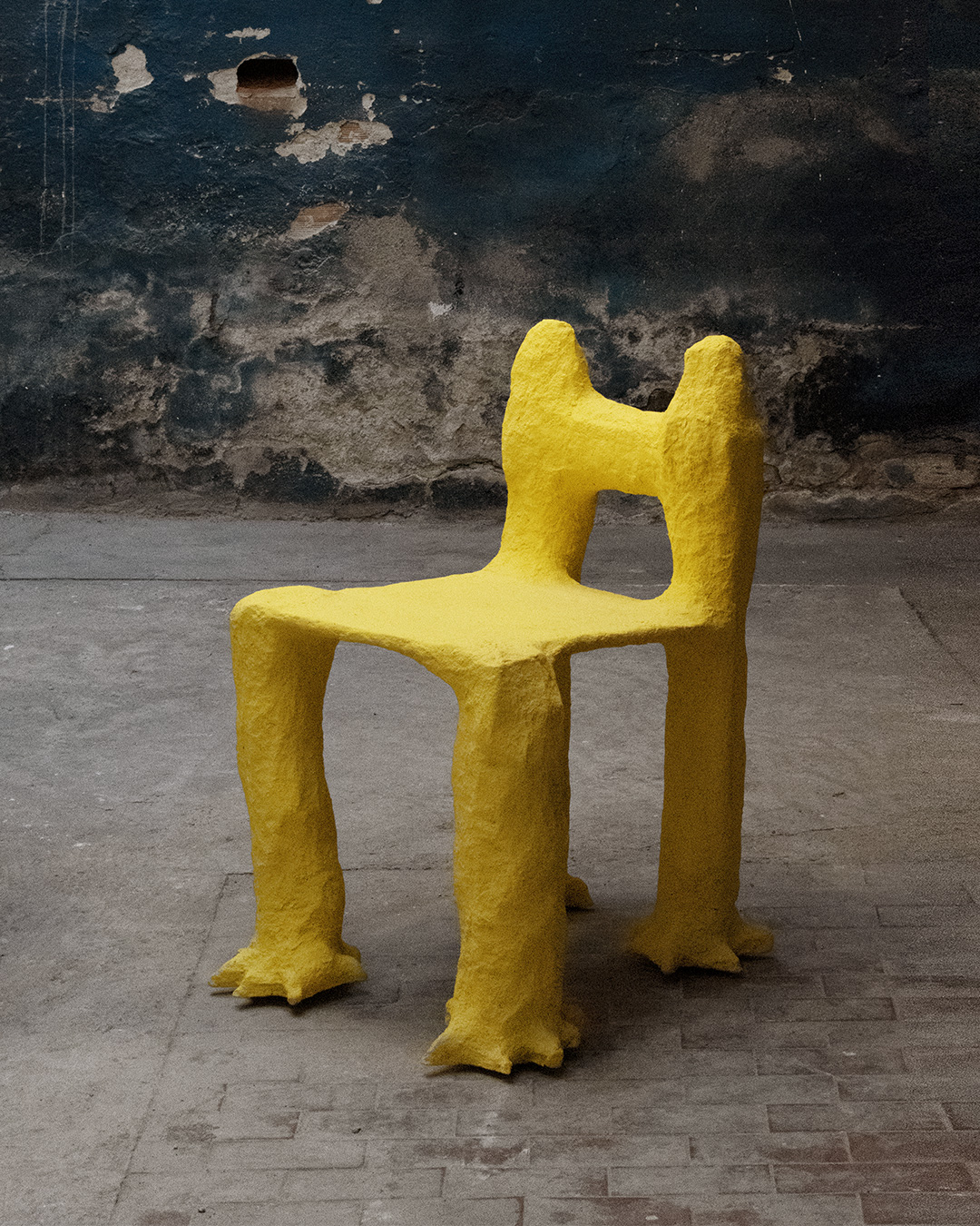
The Zampa Chair by Jonathan Bocca is a bold, yellow seating piece that radiates energy and playfulness. Its distinctive form, reminiscent of an animal’s paw, gives it a whimsical and dynamic character. The vivid yellow hue enhances its sculptural presence, making it a striking addition to any space, from a lively living room to a child’s imaginative play area. Crafted using the traditional construction techniques of Viareggio’s famed carnival floats, Zampa merges artisanal craftsmanship with an unconventional design approach. The result is a lightweight yet sturdy chair that embodies both creativity and craftsmanship, transforming everyday seating into a statement of joy and spontaneity.
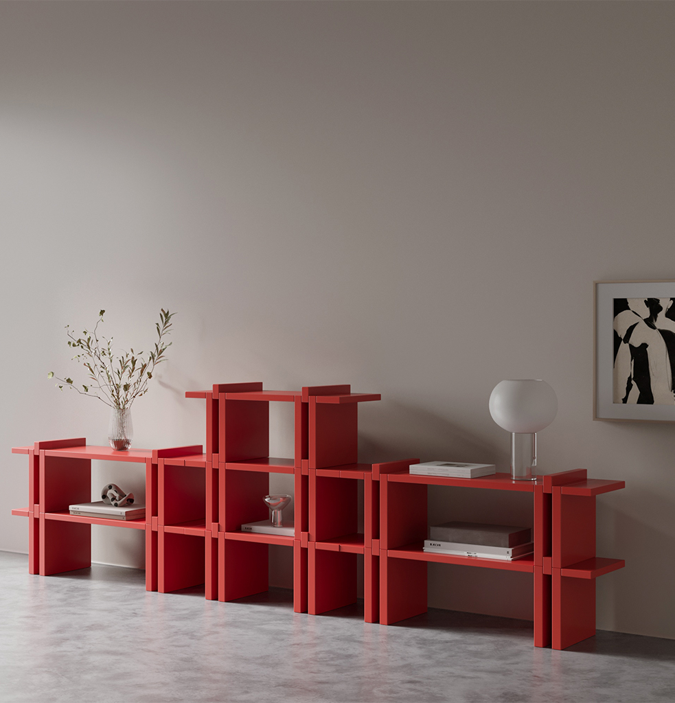
Pin – Modular Shelf System by Hermhaus
© Hermaus
Pin, by Hermhaus, is a system that invites you to explore the dynamic interplay between form and function, brought to life in a striking red hue. Inspired by the refined elegance of minimalist design, Pin is constructed from modular elements with vertical supports and horizontal surfaces, allowing endless possibilities for personalizing your space. Crafted with precision, the shelves are designed to interlock seamlessly, their simple yet sophisticated connection eliminating the need for traditional assembly. With its bold color and versatile design, Pin effortlessly elevates any interior, transforming your space into a harmonious blend of functionality and aesthetic beauty.
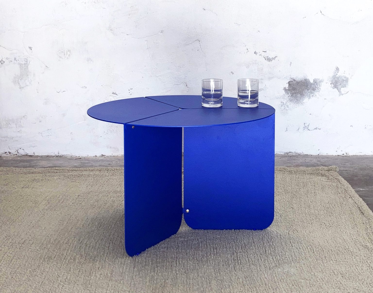
120 – Blue Metal Coffee Table by Matteo Giustozzi
© Matteo Giustozzi
The 120 Table, designed by Matteo Giustozzi, is born from the concept of creating an object starting with a single sheet of metal, folding it, and assembling the laser-cut parts. The circular form is deconstructed into three 120° segments, allowing for the combination of different finishes and colors. This innovative design comes to life in a striking blue shade, enhancing the clean, geometric structure. The folded and joined sheets of metal reassemble into a circular form, resulting in a table with a light, airy volume and a modern aesthetic. The bold blue color adds a contemporary touch, making this piece not only functional but visually captivating. Designed and crafted entirely in Italy, the 120 table is a perfect example of sophisticated, minimal design with a punch of vibrant color.
Turborama by Emma Cogné

© Emma Cogné
Turborama by Emma Cogné is a dynamic partition that unfolds like a curtain, serving as a spatial separator, filter, or shadow screen, both indoors and outdoors. Its striking yellow hue adds a bold, energetic touch to any environment. Made from an affordable and recyclable material, the durable ICTA Sheath, Turborama showcases the tube—a construction component typically hidden within walls—now brought into full view. Hand-knotted with precision, the yellow tubes create unique variations in rhythm, color, and density, offering endless possibilities for different combinations and dimensions. Whether used to define spaces or create a playful, functional design element, Turborama in its vibrant yellow form brings a fresh, bold presence to any interior or exterior.
Soft Non-Conformist chair by AaltoAalto Studio

© AaltoAalto Studio
This red metal chair by AaltoAalto Studio draws inspiration from yarn bombing and is upholstered through intricate crocheting. Featuring a steel frame wrapped in vibrant red cotton yarn, the design was created for the Rephrasals project at Malmö Form/Design Center, interpreting Inez Svensson’s 1986 Randig Banan textile print. The chair blends softness with rich contrasts, challenging conventional ideals of design. The red yarn creates a warm, organic layer over the cold steel structure, offering a tactile and visually striking contrast. Available in various colors with customizable crocheting materials on demand, this chair brings bold color and unique texture into any space, fusing art with functional design in a distinctive way.
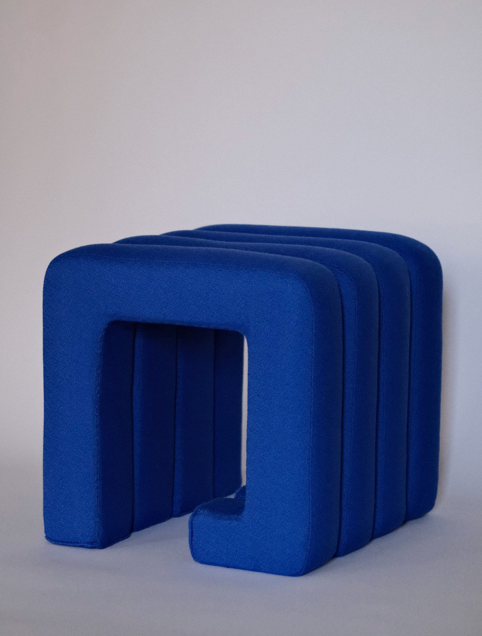
Meta – Modular Merino Wool Stool by Jaclyn Pappalardo
© Jaclyn Pappalardo
The blue modular stool by Jaclyn Pappalardo, upholstered in luxurious Bute merino wool, combines versatility with bold design. Its interlocking system seamlessly connects individual sections, allowing for endless customization through color choices and configurations. Designed to adapt, the stool can expand into a five-part, six-part, or even an infinite-length bench, offering both flexibility and a striking visual statement. The deep blue hue enhances its sculptural presence, transforming a functional seat into a dynamic, ever-evolving piece of furniture that blends comfort, craftsmanship, and modular innovation.
Sunny Side Up – Yellow Wall Mirror by Estelle Makes Stuff

© Estelle Makes Stuff
The Sunny Side Up Mirror by French artist Estelle Pigault is a wall-mounted mirror characterized by its bold yellow frame and playful, maximalist design. More than a reflective surface, it functions as a decorative statement piece, bringing a strong visual presence to any space. The striking yellow color enhances its sculptural quality, transforming it into both a functional object and an artistic element within an interior.
Cor Red Ceramic Vase by Pepa Reverter

© Pepa Reverter
The Cor Vase is a handcrafted ceramic piece by Tot Cor Project in Barcelona, designed by Pepa Reverter. Finished in a bold, vibrant red, its form is inspired by Ettore Sottsass’s Shiva vase from the 1970s, a time of cultural revolution and liberation. Cor builds on this legacy, shifting the focus toward deeper human values—love, compassion, ethics, and generosity. Shaped like a heart, the vase’s striking red hue reinforces its symbolism as a universal expression of passion and kindness. More than just a decorative object, it is part of Tot Cor, a solidarity-driven art project dedicated to collaboration and social good. With its deep red presence, Cor serves as a reminder of the power of empathy and the enduring warmth of human connection.
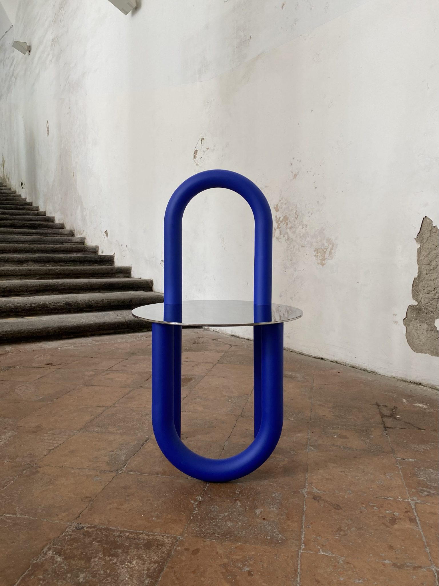
Sedia 2 by Julia Chiaramonti
© Julia Chiaramonti
This blue chair by Giulia Chiaramonti transforms the concept of a continuous line into a bold, three-dimensional form. What is typically an infinitely thin graphic element is expanded and inflated into a striking structural presence. This materialized line shapes both the backrest and legs, while its mirrored counterpart in the polished stainless steel seat completes the composition. With its deep blue hue, the chair becomes an interplay of form and reflection. Depending on the observer’s perspective, the physical and mirrored lines shift, creating ever-changing graphical compositions. The result is an object that is both sculptural and functional, where color, material, and perception come together in a dynamic visual experience.
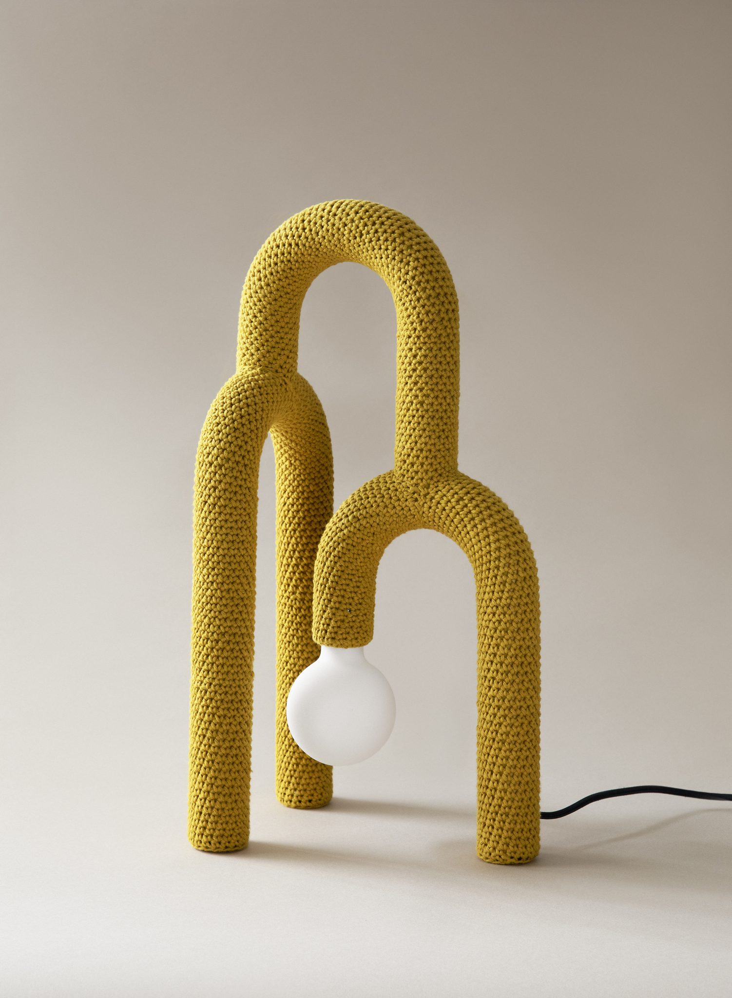
Cumula – Yellow Arcs Crochet Table Lamp by AaltoAalto Studio
© AaltoAalto Studio
The Cumula Crochet Table Lamp, designed by Finnish design house AaltoAalto, stands out in a vibrant yellow hue, adding a bold, playful touch to any space. Emerging from the Fiskars Design Biennale exhibition, Hidden, in 2022, it explores the intersection of senses in design and art. The lamp’s unique visual character—a collection of identical arcs—reveals its true function only upon closer inspection, offering a delightful surprise.
Wrapped in a soft, hand-crocheted outer layer, the yellow lamp hides its inner materiality, offering a surprising tactile experience. The steel frame, subtly influenced by Bauhaus design principles, is enveloped in this cheerful crochet work, making Cumula not just a light source, but a sensorial exploration that harmoniously blends form, function, and vibrant color.
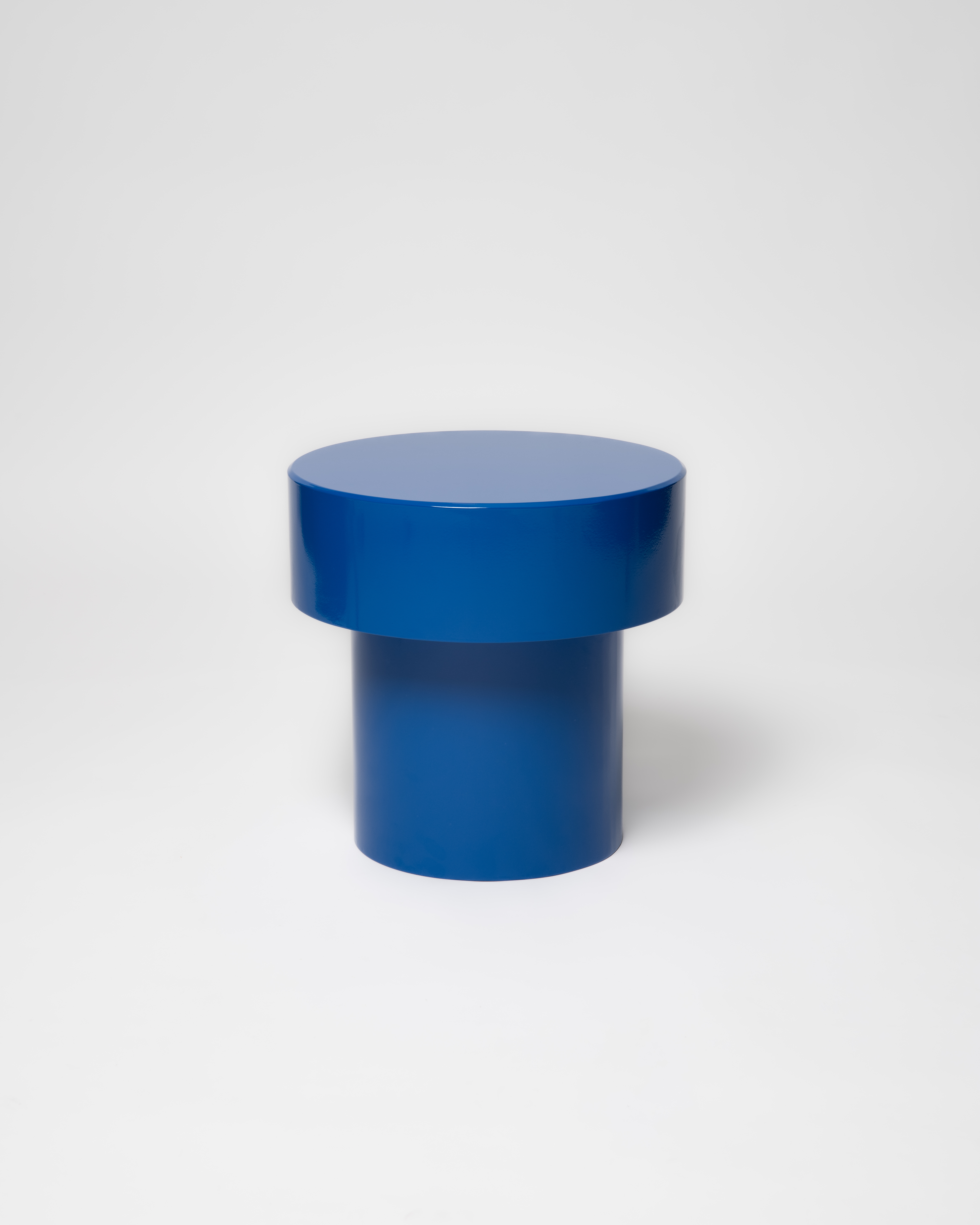
PION – Blue by OHM studio studio
© OHM studio studio
The PION Stool, designed by OHM Studio, playfully balances minimalism and whimsy, drawing inspiration from everyday objects like nuts, corks, and toys. Its versatile design allows it to function as a stool, side table, or bedside table, available in monochrome or vibrant polychrome variations.
Handcrafted in France from recycled steel, PION combines durability with a powder-coated finish that enhances its bold, sculptural form. More than just furniture, it’s a thoughtful blend of color, simplicity, and adaptability—bringing a touch of playful elegance to any space.
-
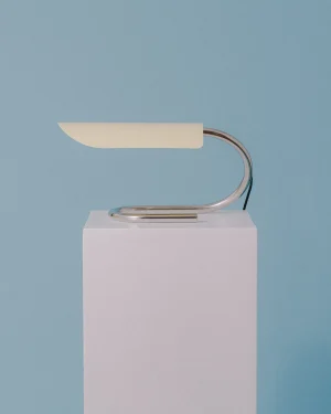
 Poser – Stainless Steel Table LampBy Emil Robbrecht€558 incl. tax€558 incl. tax
 -
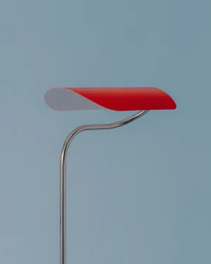
Poser – Stainless Steel Floor LampBy Emil Robbrecht€1.240 incl. tax€1.240 incl. tax
-
Stouek – Bio Plastic StoolBy BLUBA Studio€355 incl. tax€355 incl. tax
-
Trn / Model B4 Ceramic Pendant LightBy Pani Jurek STUDIO€1.100 incl. tax€1.100 incl. tax
-
Patina – Hand painted ChairBy Better Weather Design Studio€3.125 incl. tax€3.125 incl. tax
-
Fold St01 – Washi Paper Floor LampBy HEIKE BUCHFELDER€6.040 incl. tax€6.040 incl. tax
-
Organic 100% Cotton Table MatBy BOI€63 incl. tax€63 incl. tax
-
Organic Cotton Table MatBy BOI€63 incl. tax€63 incl. tax
-
Umu – Pendant U LampBy Drusch Design€835€835