Pantone Color of the Year 2026: Cloud Dancer Brings a Change in Tempo
Since Pantone introduced its Color of the Year program in 2000, the chosen shades have typically been expressive and demonstrative. Bold selections such as Radiant Orchid (2014), Tangerine Tango (2012), Viva Magenta (2023), and Living Coral (2019) acted as cultural signposts linking design to broader creative impulses. There have been neutrals – Sand Dollar in 2006 and Ultimate Grey in 2021, for example – but each retained enough saturation or tonal weight to assert itself visually. The Pantone Color of the Year 2026, Cloud Dancer, is the first near-white selected as Color of the Year. Its name, abstract and evocative rather than anchored to a specific object or sensation, reflects a shift in how color is being conceptualized for 2026.
Color as Cultural Signal
Pantone’s program positions the year’s chosen color as an expression of collective mood. The Pantone Color Institute describes the selection process as a way to “draw attention to the relationship between culture and color,” highlighting how global conditions register through color. Cloud Dancer takes the stage at a moment shaped by information saturation, accelerated visual culture, and an ongoing negotiation between digital life and human presence.
Notably, the name itself marks a departure. Among past selections, Tangerine Tango stands as the sole example that references a human activity, yet even then the focus remained on the act rather than the actor. Cloud Dancer shifts the language from movement to embodiment. A dancer implies a person, a body in motion. This introduces an explicitly human subject into the color narrative for the first time. The shift aligns closely with Pantone’s framing of the year as one shaped by a renewed desire for balance, embodiment, and connection, suggesting that color in 2026 is meant to support human experience rather than operate purely as visual stimulus.
A Supporting Role for Color
The official narrative from the Pantone Color Institute frames the current moment as one in which people are “seeking truth, possibility, and a new way of living,” and describes Cloud Dancer as “a symbol of calming influence” for a society navigating competing demands. The selection signals a departure from traditionally saturated color choices toward a more structural role for color in design. Cloud Dancer is positioned to act as a supporting element, shaping environments without dominating them.
Platform Color Trends and Saturation
This emphasis on subtlety stands in interesting juxtaposition to other color behavior emerging across platforms like Pinterest. Pinterest’s 2026 color forecast identifies a palette of five vibrant and saturated tones: Cool Blue, Jade, Plum Noir, Wasabi, and Persimmon, based on billions of searches and saves from its global user base. These colors span from icy blues and earthy greens to rich purples, electric greens, and bold red-oranges, reflecting a design conversation that remains expressive, contrasting strongly with the restraint suggested by Pantone’s near-white. The Pinterest data suggests interest in both grounding and energetic tones that users are actively engaging with in real time, indicating that color behavior in 2026 will be multifaceted and contextually driven.

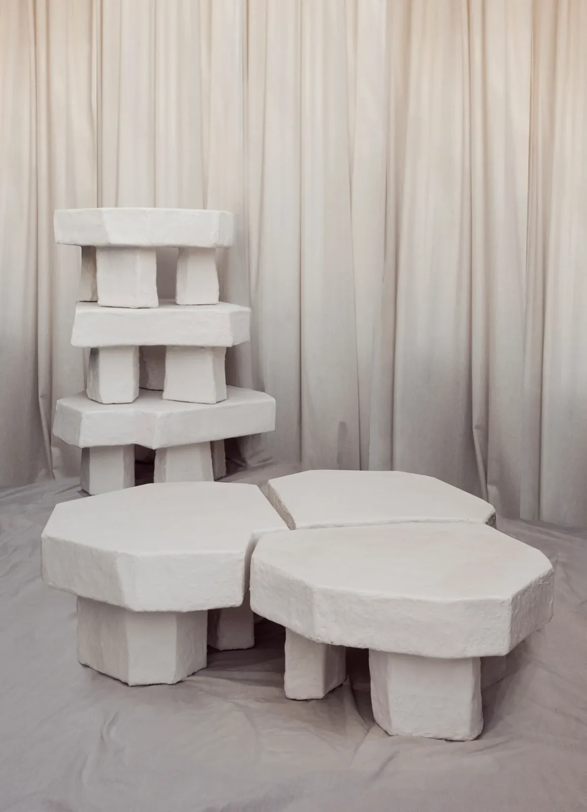
Light, Reflection, and Material Interaction
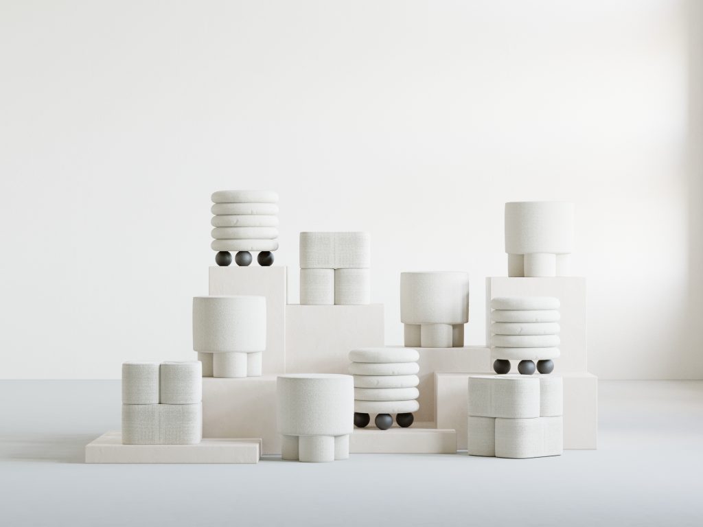
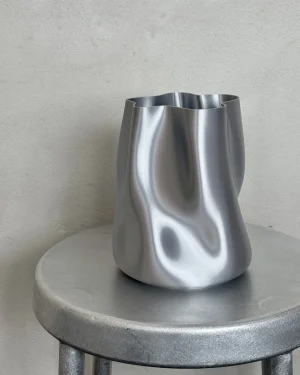
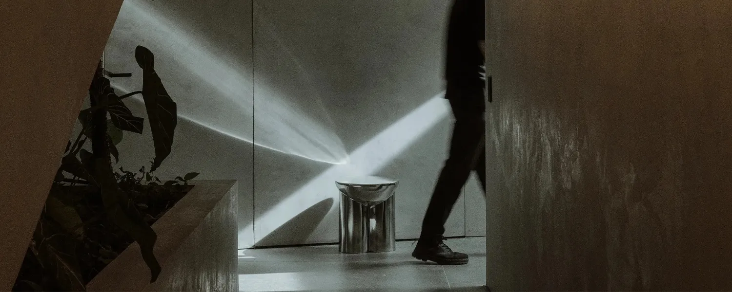
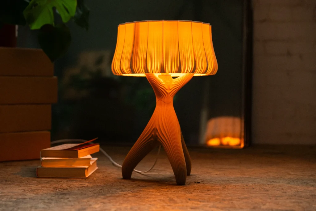
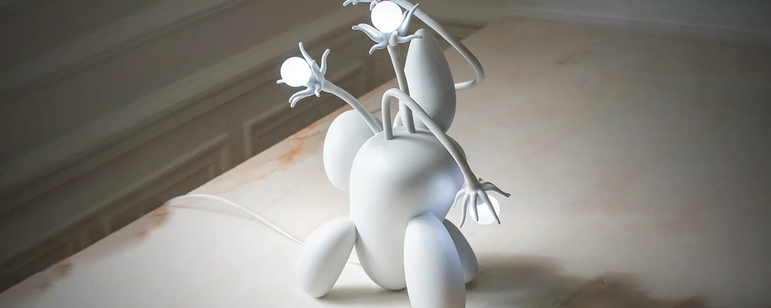
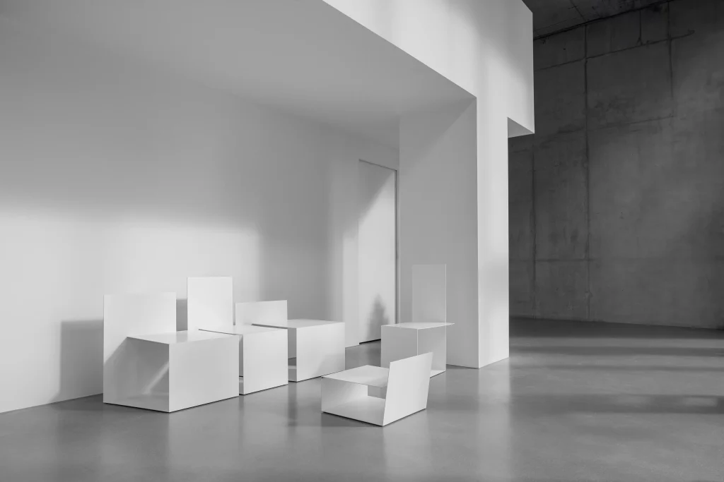
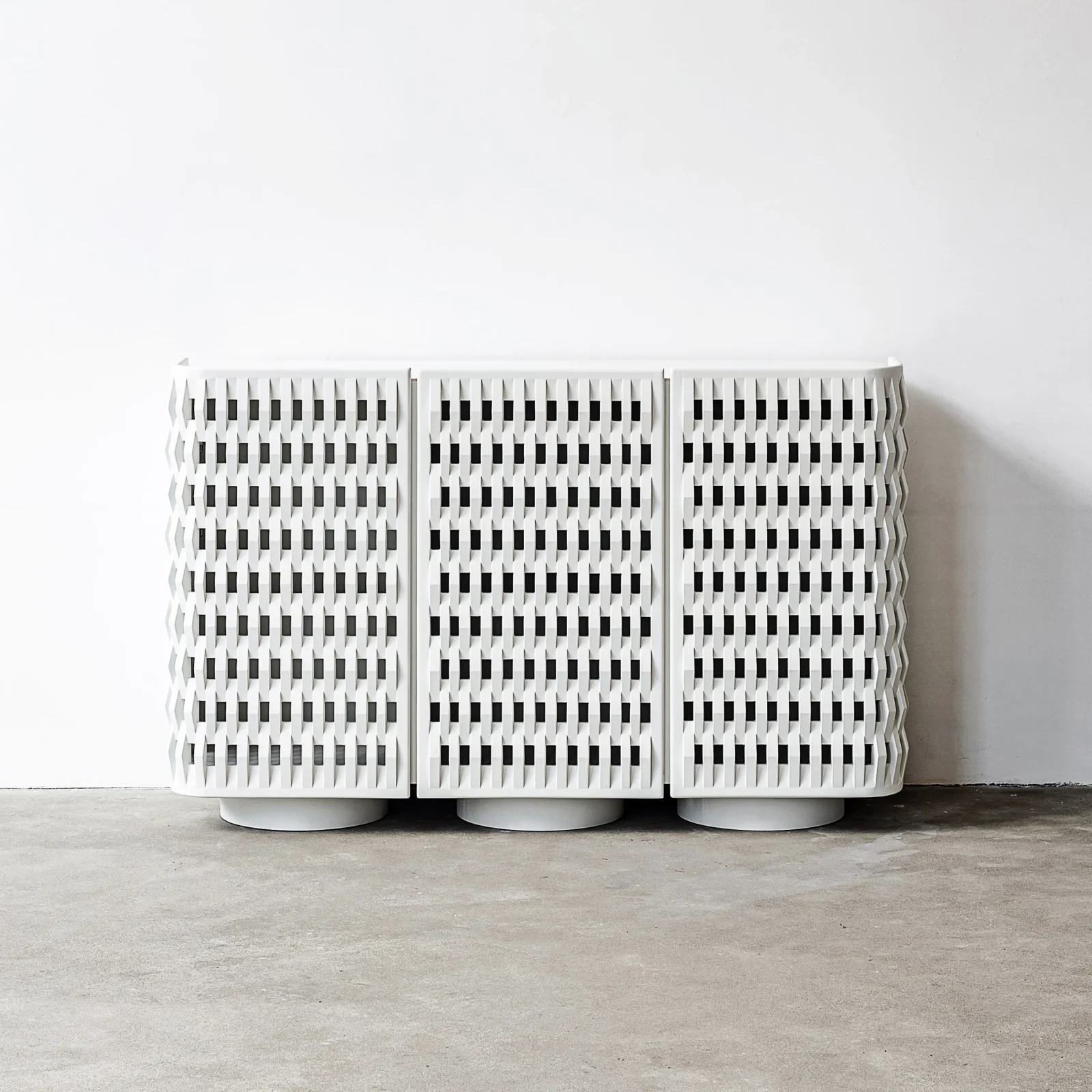
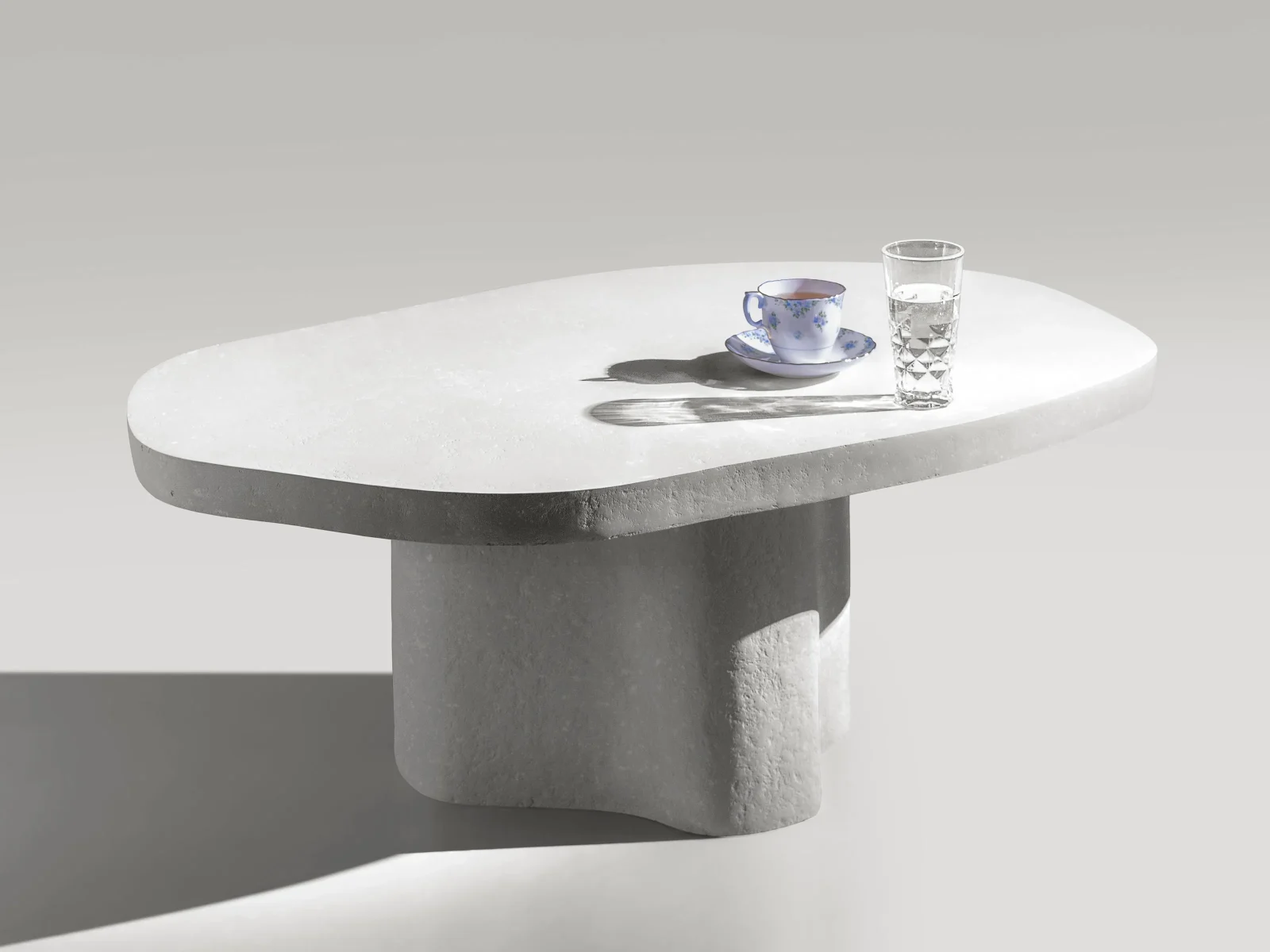
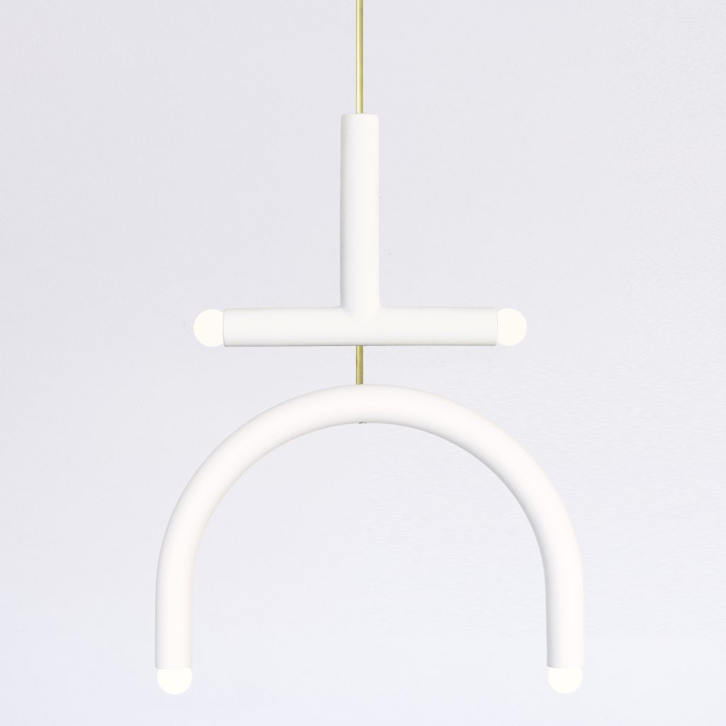
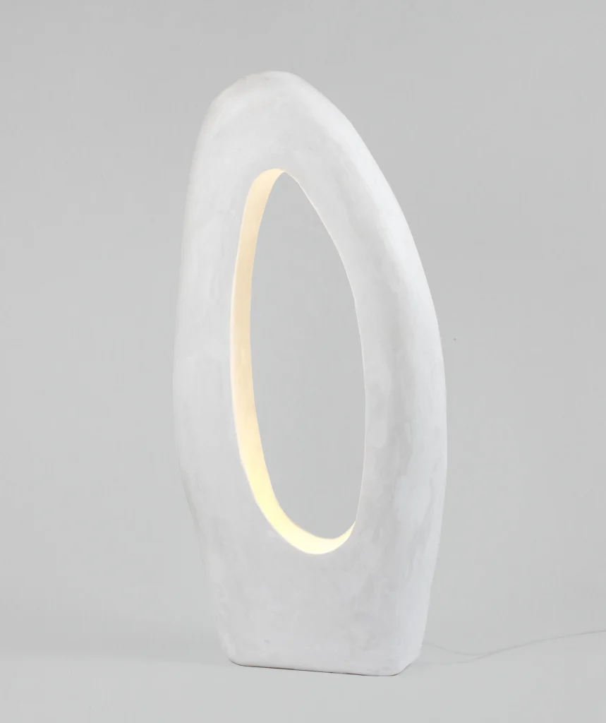
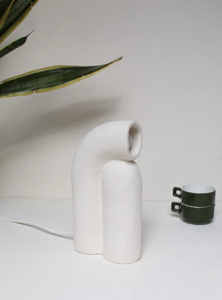
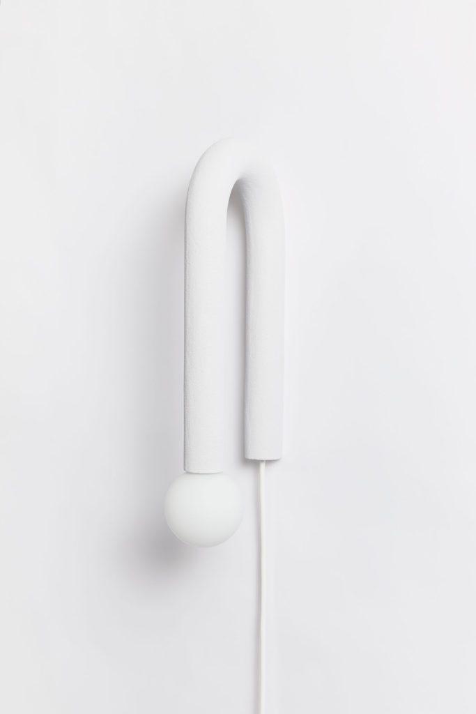
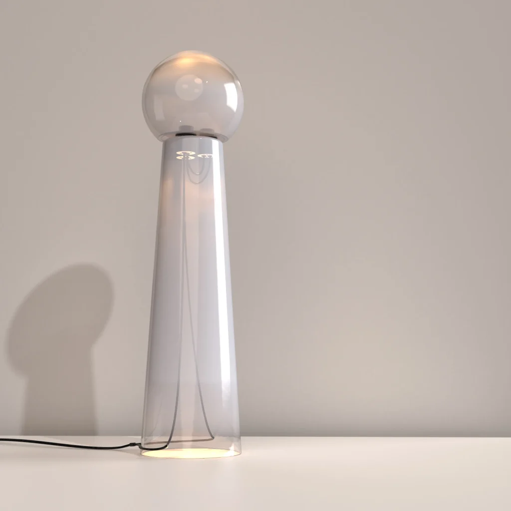
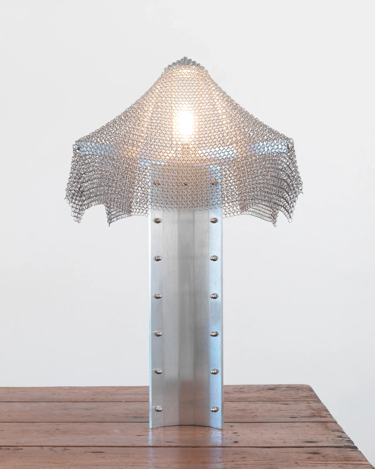
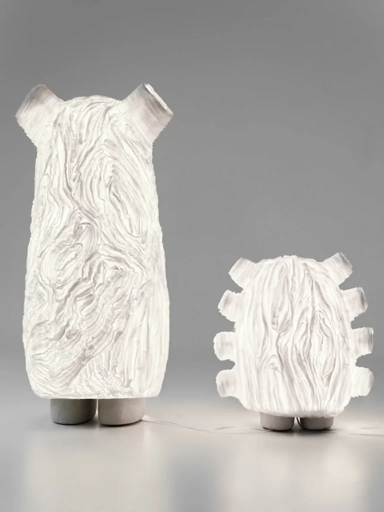
Cloud Dancer’s role becomes clearer in this broader context. Its absence of saturation allows it to function as an ambient field rather than a focal point. In practical terms, this means that Cloud Dancer often appears through interaction rather than pigmentation. Surfaces that are metallic, glazed, or translucent can reflect its lightness; stainless steel, hand-blown glass, and glossy ceramics reveal Cloud Dancer through the way they catch and diffuse light rather than through the color itself. This reflective presence aligns with how designers and makers think about material and finish as equal partners with color, enabling spaces where light behavior and surface interaction become part of the chromatic experience.


Human Connection and Design Practice
Pantone further explains that Cloud Dancer “signifies our desire for a fresh start,” encouraging environments that help focus and invite creativity. Laurie Pressman, Vice President of the Pantone Color Institute, situates the choice in the broader cultural negotiation between an “increasingly digital future and our primal need for human connection,” underscoring the color’s relational role. In design practice, Cloud Dancer supports interiors that emphasize texture, form, and layered experience.
Reframing Neutrality
Cloud Dancer’s introduction as a foundational, near-white color in 2026 suggests a broader shift in how color is leveraged in design. It reframes neutrality as agency, a strategic tool for shaping space and experience rather than a default backdrop. Rather than competing with bold palettes and maximal gestures, Cloud Dancer reframes color as a condition for connection and relation, where light, surface, and movement register through the body as much as the eye.