Vito Nesta at Crossovers: A Journey Designed in Full Color
“I have used black very few times in my works,
to me, it is a useless and cold convention.”
– Vito Nesta


Try and think back to a location from your childhood and create the most accurate image of it you can possibly imagine. We can start with physical objects, the architecture, natural landscape, etc… then move along to the people we shared this space with, what colors do you remember and what scents? The more we try and recreate this place the more feelings will start to arise, maybe you can start to feel the sun hitting your skin just as you had felt at that moment. You can start to remember how exactly you felt at that point in your life, the nostalgia sweeping up warm or mixed emotions inside you as you think of the journey you were in and who was with you at the time. How you have changed into the person you are today? These places that have had strong impacts on us in the past are deeply engrained within our minds and usually have been revisited multitude of times either in dreams or daydreams, but each time they are revisited these mental/internal locations change. This happens so much so that if you have seen this place many years later you may have been shocked with the reality versus your memories. Whose to say though if these mental locations, these interal portals to distant locations are any less important or any less real for that matter?
Italian designer, Vito Nesta explores this journey to places and locations inspired by locations and real-world locations and cultures, however through meticulous and intensive use of color, form, and texture is able to translate these emotional journies into objects that inhabit a physical world. Inspired by the grand archways, windows and gateways of the interiors of Milan, Italian designer, Vito Nesta chose to capture these De Chirico-esque portals and bring these objects to live with full vibrant colour this treatment and devotion to colour is a cornerstone of Nesta’s practice, and you will very rarely see black in any of his works, a color which he views as a useless and cold convention. Taking full advantage of color’s ability to transport us to different worlds, and its firm connection to memory and even scent, Nesta’s works always take us on a different journey, either to exotic, far-away lands or in this case to Via Fucini
Supported by the outstanding knowledge and techniques of Tappezzerie Druetta, which carries on his research on bespoke upholstery furniture since 1953, Vito Nesta balanced his peculiar vision with references from the past. The colors of this project, for instance, are inspired by Gio Ponti, which in 1952 titled an article penned for the magazine “Everything in the World Must Be Colorful”. “Cast a red floor throughout the house, a lake of fire, with white walls and ceilings, and curtains colored red, yellow, or red and yellow, which is another beautiful range. But also (emerald) green tones”, Ponti wrote. The same colors Nesta selected instinctively for his Via Fucini 5 project. A small, domestic, bright Italian architecture.

Where do you get the inspiration for your dense, rich and color palate?
I always loved colors as the world is made of colors, of intense ones. Also, tradition is something I always liked, the real and colorful tradition. Therefore, designing by using colors is a way to celebrate life and to improve it. When I start a new project I always try to imagine which color would suit better, which would succeed in transmitting the intensity of that narration. I used black very few times in my works as to me, it is useless and a cold convention

How is this color an important tool for you to relate a specific time, memory or emotion in viewers interacting with your works?

Some of the most prevalent inspirations for your work, from a visual standpoint, come from an era of infatuation with the exotic, perhaps from the 1800s, how do reinterpret this to fit a contemporary aesthetic?

The work you are exhibiting at Crossovers has such a strong architectural presence, what where your influences for creating this specific work?
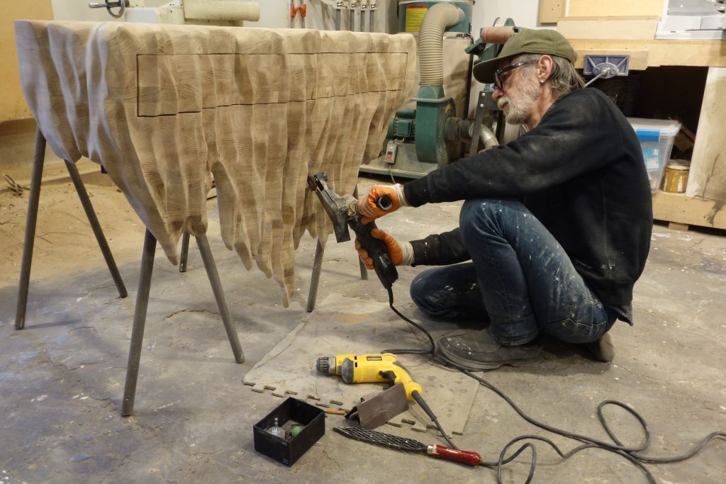
The theme of this project is the interiors of Milan. I have always been fascinated by the colorful and grand windows of the gates. It is a distinctive sign of Milan, and it is a shame that they are not using them anymore in the new buildings/constructions. It often happens to me to when I stroll around the city to stop infant of one of them, the ones I define as micro museums. I observe the drawing on the windows that, due to their sophisticated colors, look like the just came out some paintings of De Chico and I try every time to capture them and make them mine. When I was asked to design a work [for Crossovers] I immediately decided to be inspired by them. This resulted in an extrusion of a window situated on via Fucini 5 which has given life to this bench.

Some series of your works focus on a specific location, for example Cairo and Kenya, in others without figurative representation, this cultural influence still shine through. Do you always try to represent a real location in your works or is it more about creating a world of imagination for the viewer?
My work includes always both a realistic aspect of life but also some fantastical element that come from my imagination. This enables the audience to be transported in that specific place, but at the same time they have room for interpreting it. It is incredible for me to see how a person interacts with my objects/designs. Every person in fact has a different perspective, depending on their emotion.


Crossovers by Adorno will present a range of collections of dynamic works by independent designers from a selection of local scenes. The exhibition celebrates the designers and communities playing a central role in maintaining and renewing today’s local design and crafts cultures. Vito Nesta’s work and the works presented in the Italian Collection by Annalisa Rosso and Francesco Mainardi show the power of sheer creative force in the face of a world in constant influx of influences and visual noise, moulding diverse subject matter into a refuges of peace of mind. Presenting these works together with works from 10 other top design scenes from around the world creates a cross-cultural dialogue to examine the current state and future of contemporary design.
To preview the Italian collection and stay up to date on the release of further news & previews sign up to our newsletter below.

Bio
Vito Nesta is a designer who graduted in Interior Design in Florence; although originally from Puglia, he lives and works in Milan. Designer, art director, interior decorator and artisan, he’s driven by his attraction to foreign culture, using his travels as a persistent form of inspiration. His creative thoughts are expressed through projects of graphic and product design, interior decor, photography and painting. The companies which today showcase his work are Cadriano, Devon & Devon, Effetto Vetro, Fratelli Majello, Imarika, Karpeta, Les-Ottomans, Riva 1920, Roche Bobois, Sanbonet, Texturae and Secondome Gallery.
Supported by: